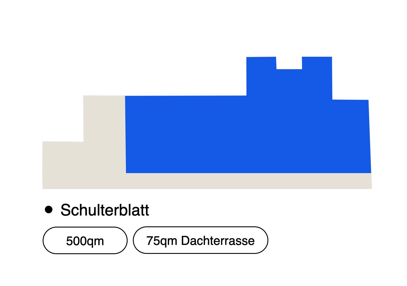
abj architects
A working world built from values, 2025 - completion 2026 (ongoing)
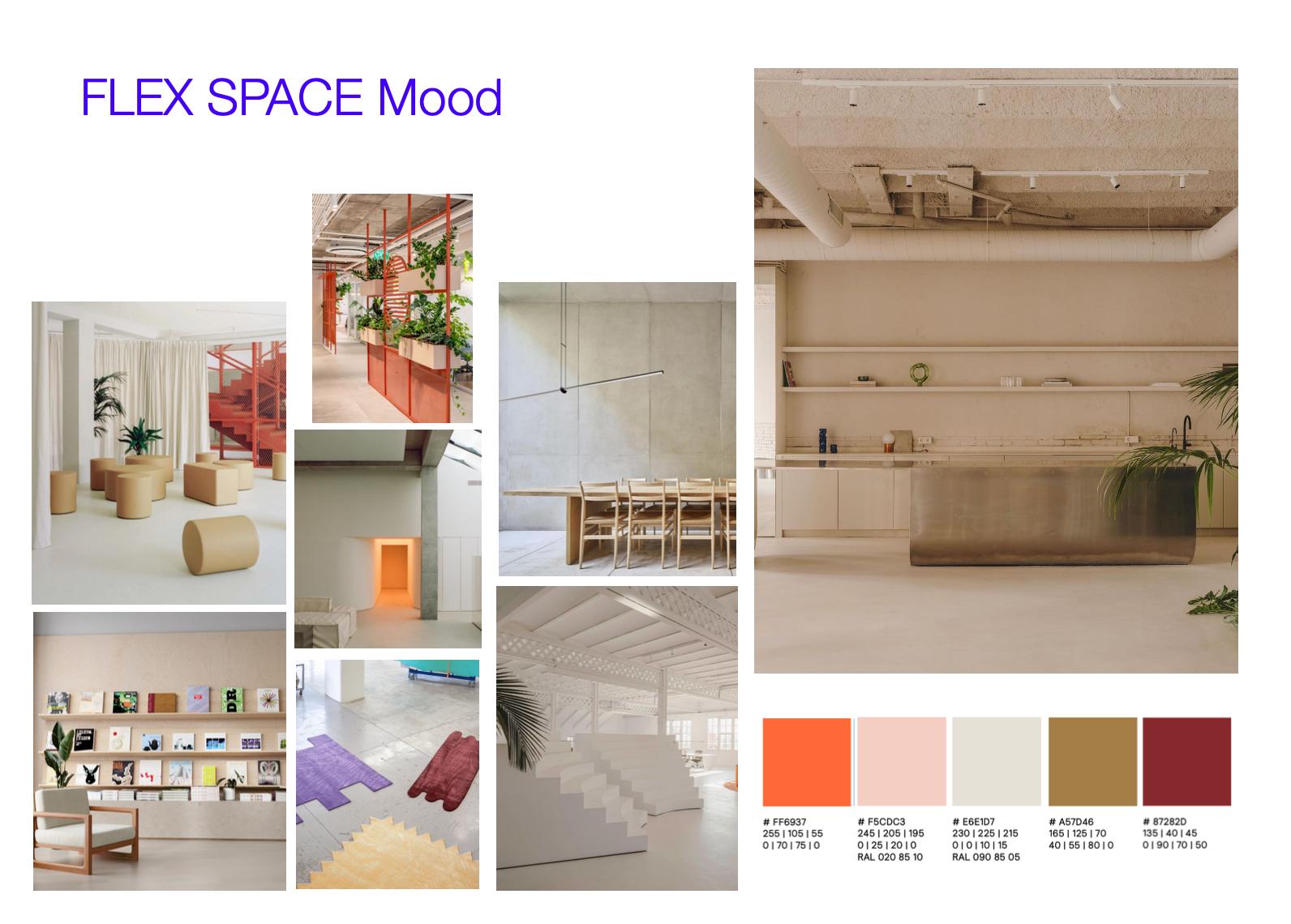
abj architekt:innen are a Hamburg-based practice dedicated to creating meaningful, human-centered spaces, architecture that supports growth, orientation, and everyday life.
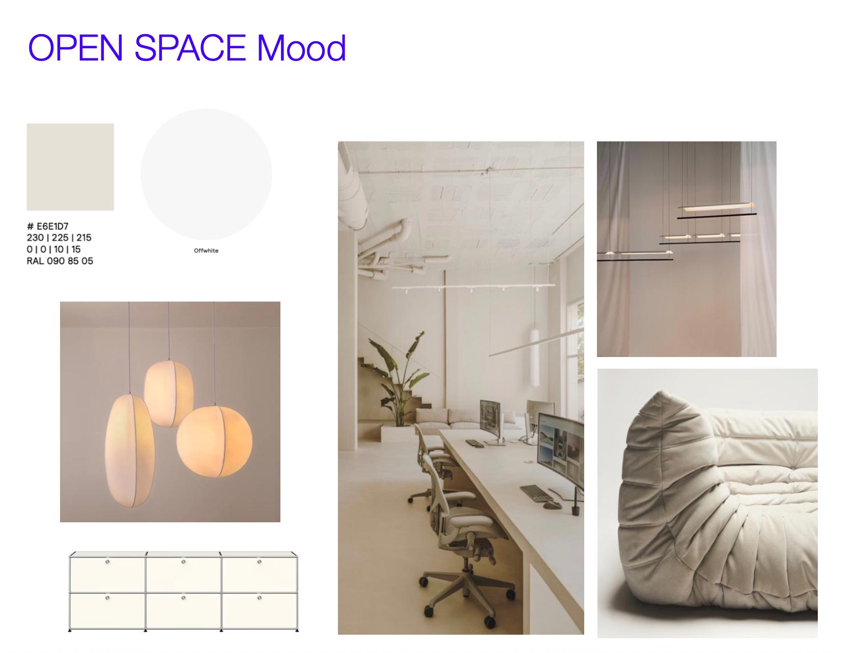
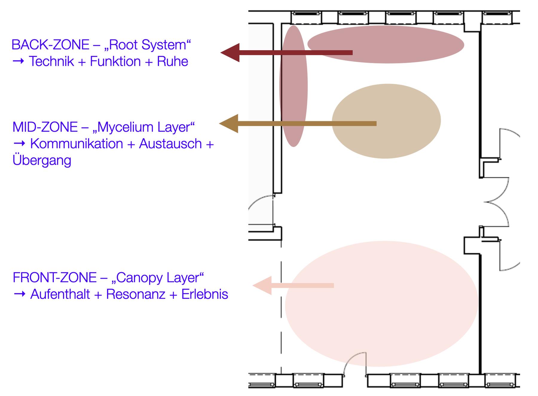
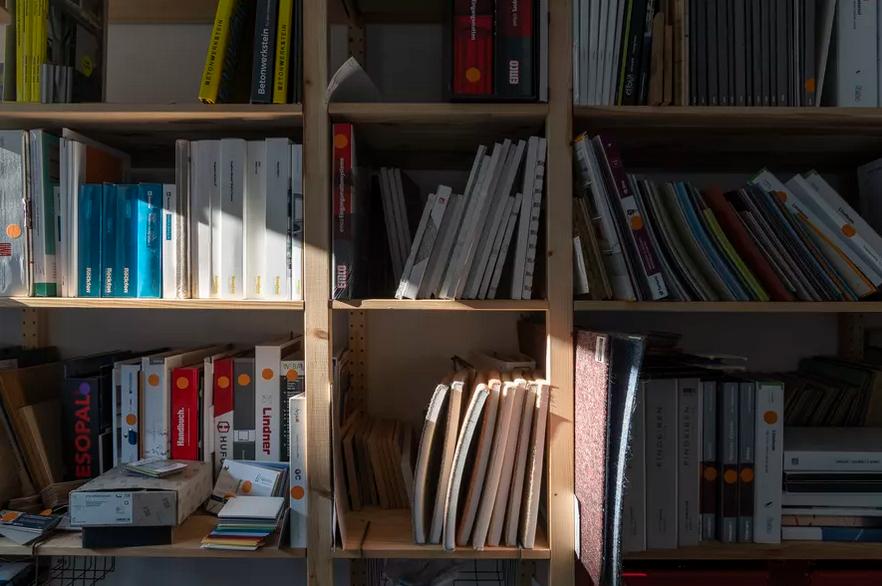
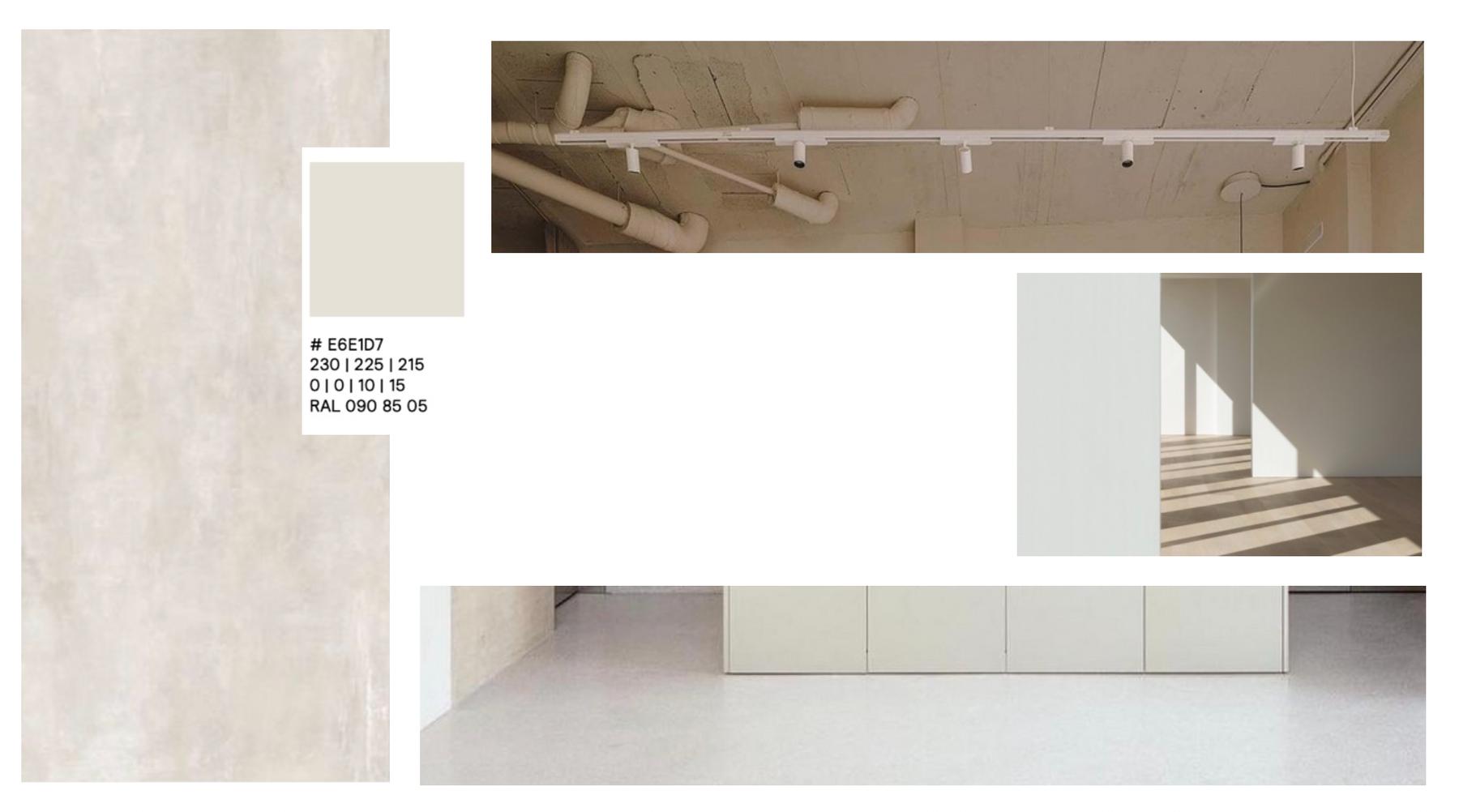
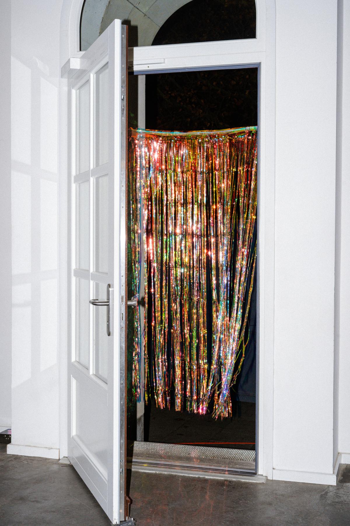
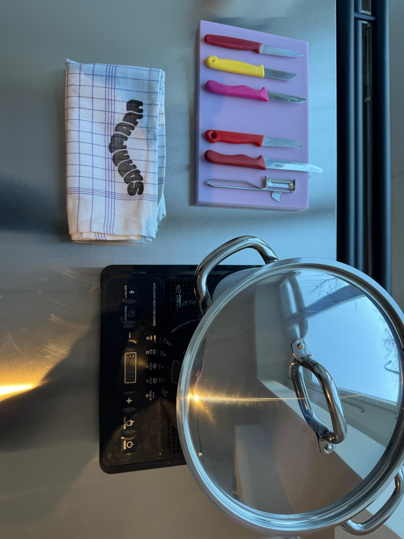
As the team prepares to move into a new studio, I am shaping the spatial identity together with an internal taskforce — a continuous process that translates abj’s core values into the logic and atmosphere of their future workplace.
My work focuses on the design narrative, the atmosphere, and the functional logic of the rooms: how materials, zoning, and flow can express who abj are and support how they work — and how this becomes tangible in the concrete furnishing and configuration of each space.
The system provides orientation for all decisions throughout the ongoing transformation.
Completion: July 2026
Client: abj Architekt:innen GmbH
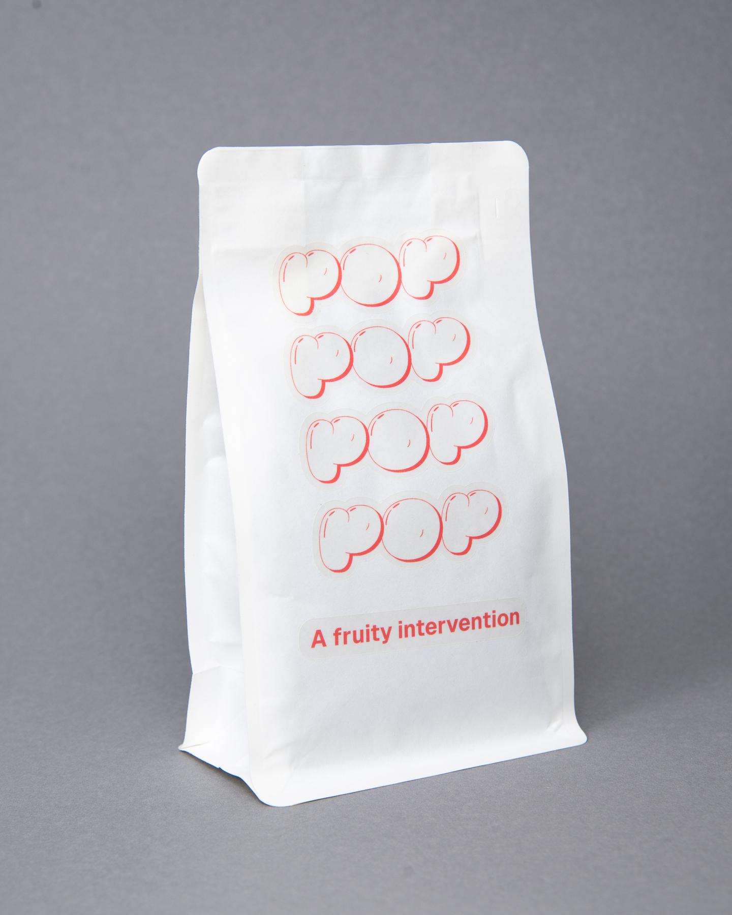
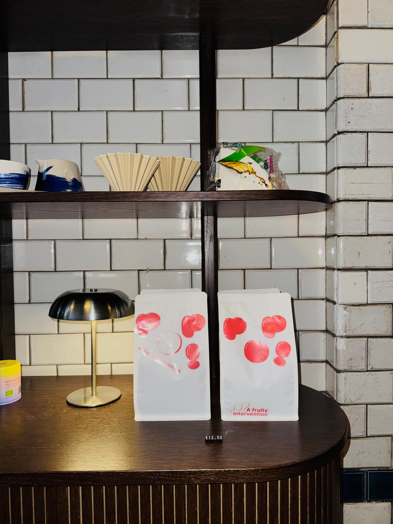
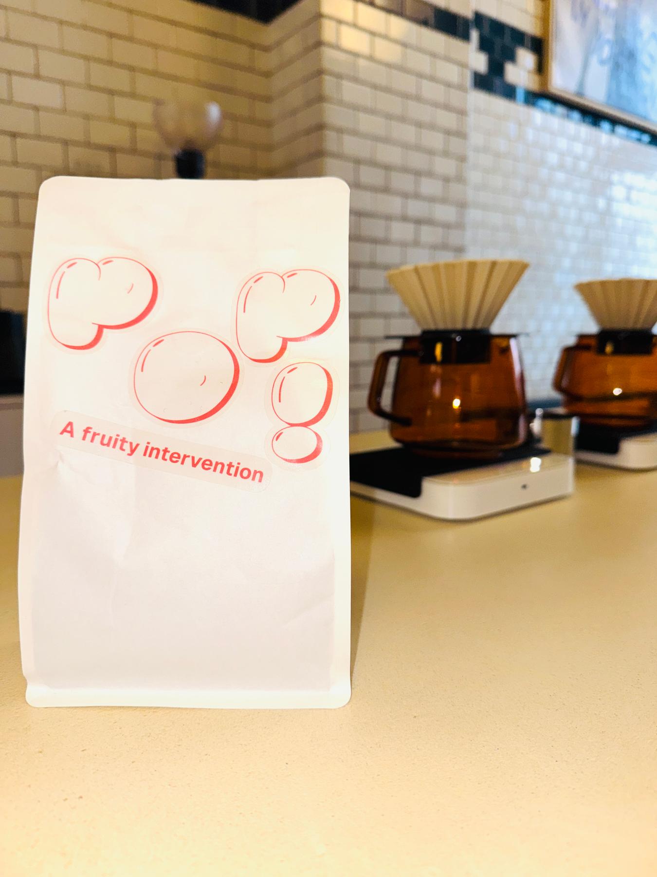
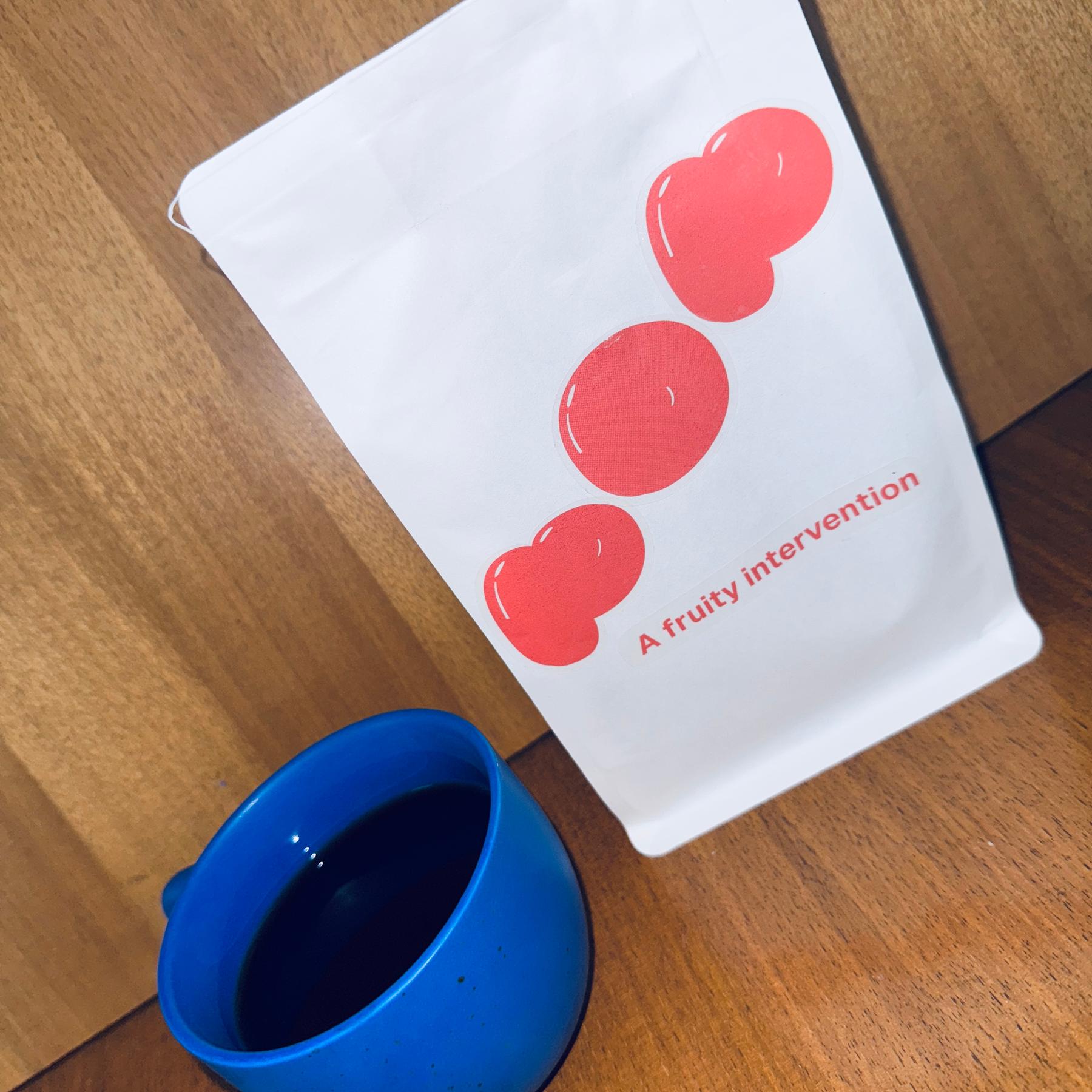
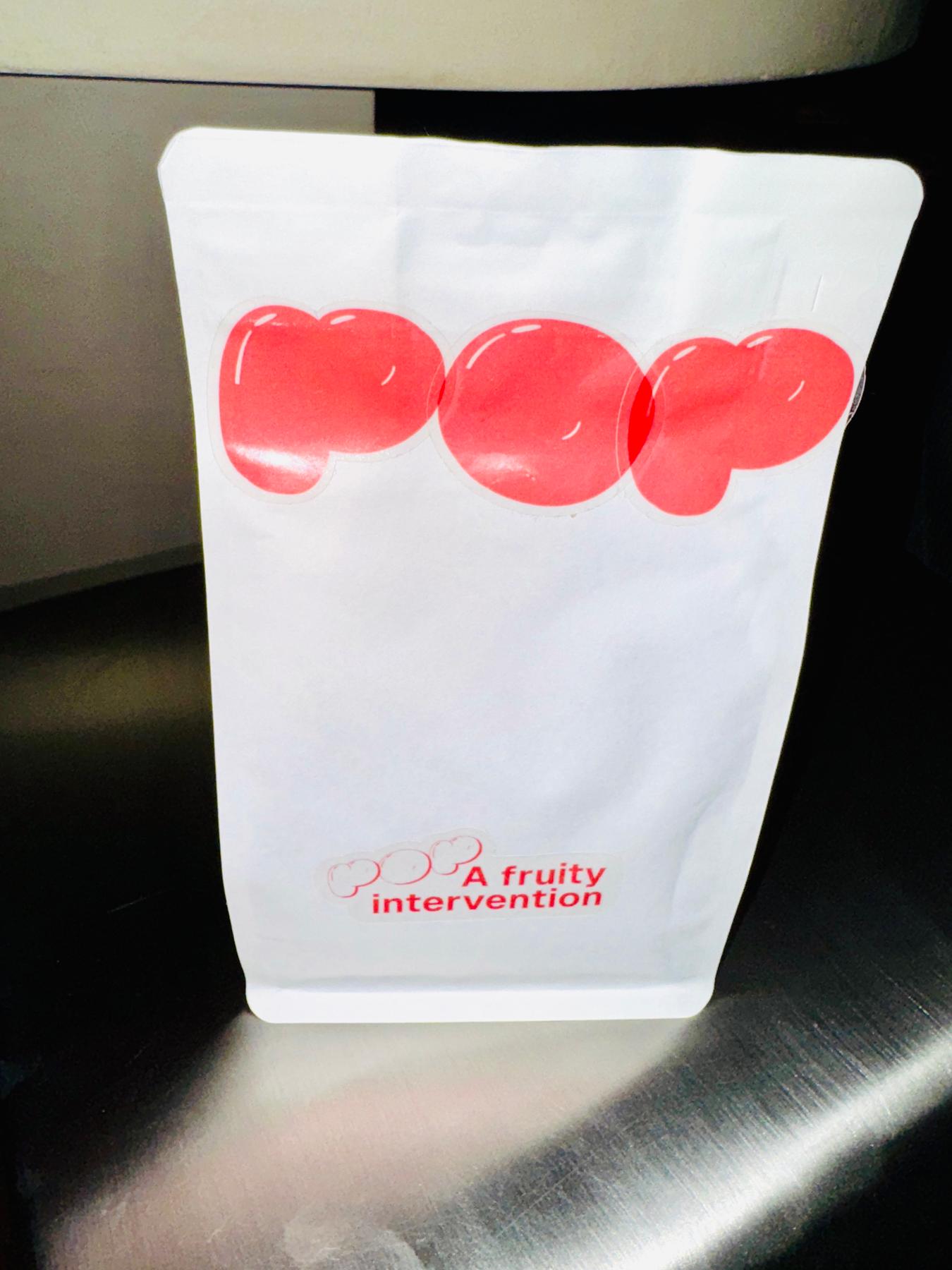
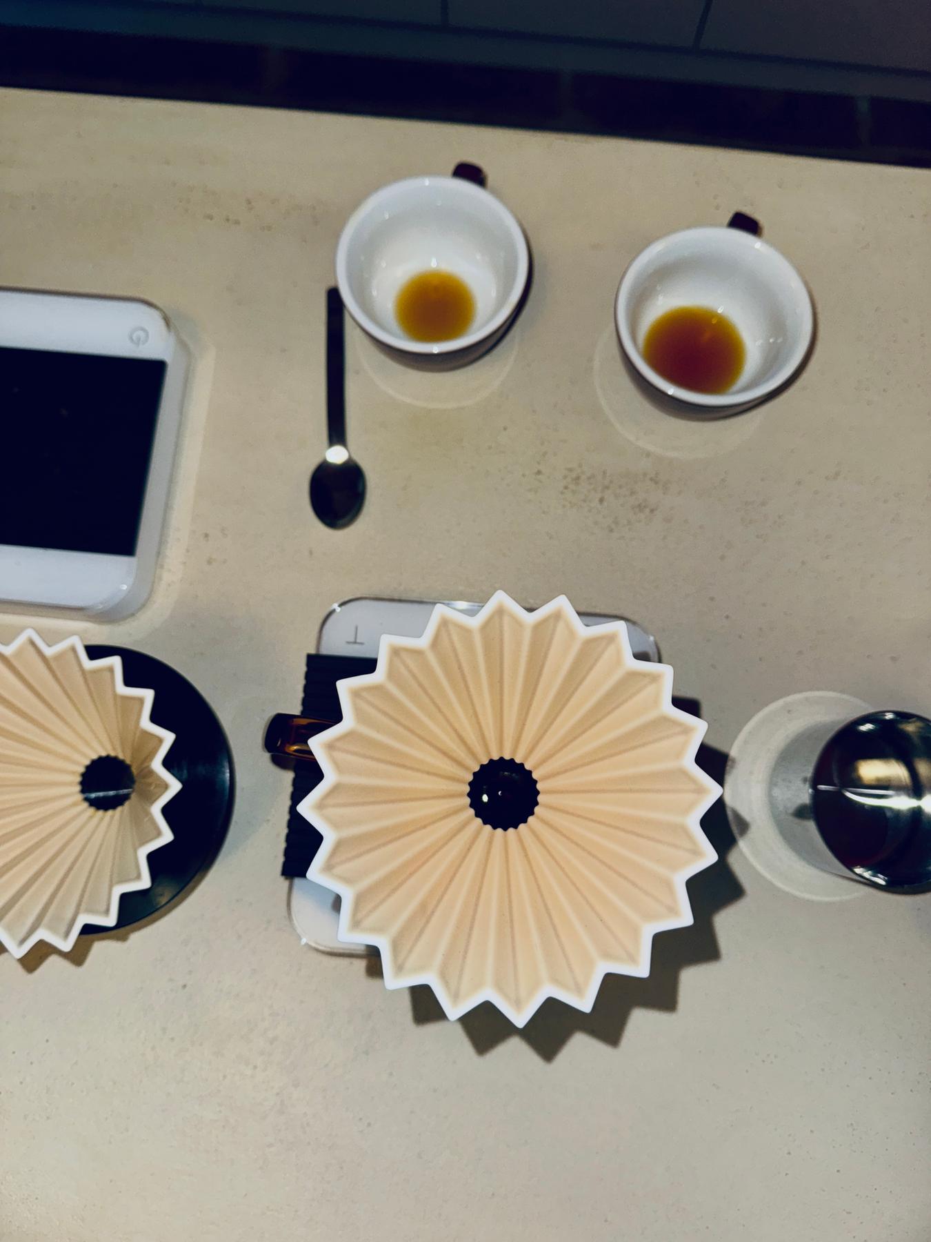
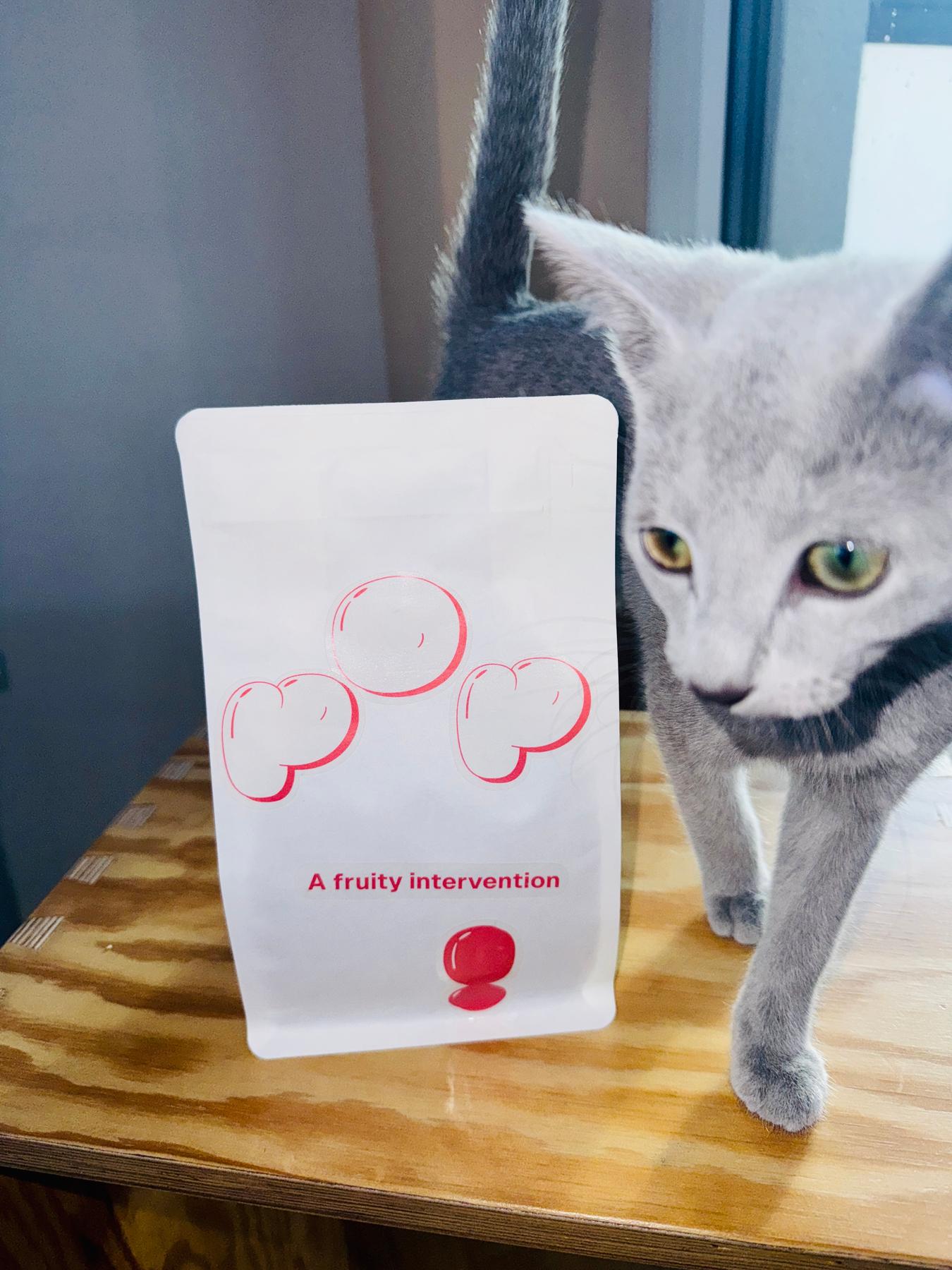
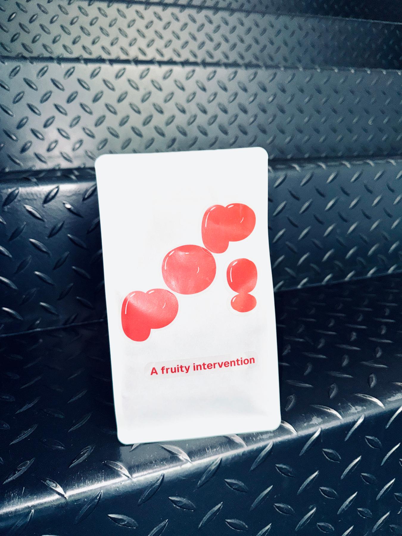
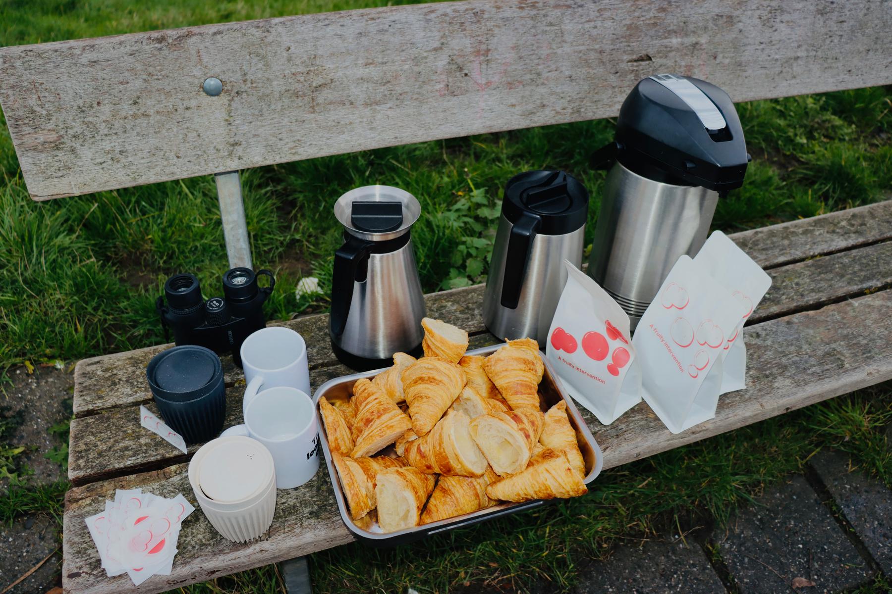
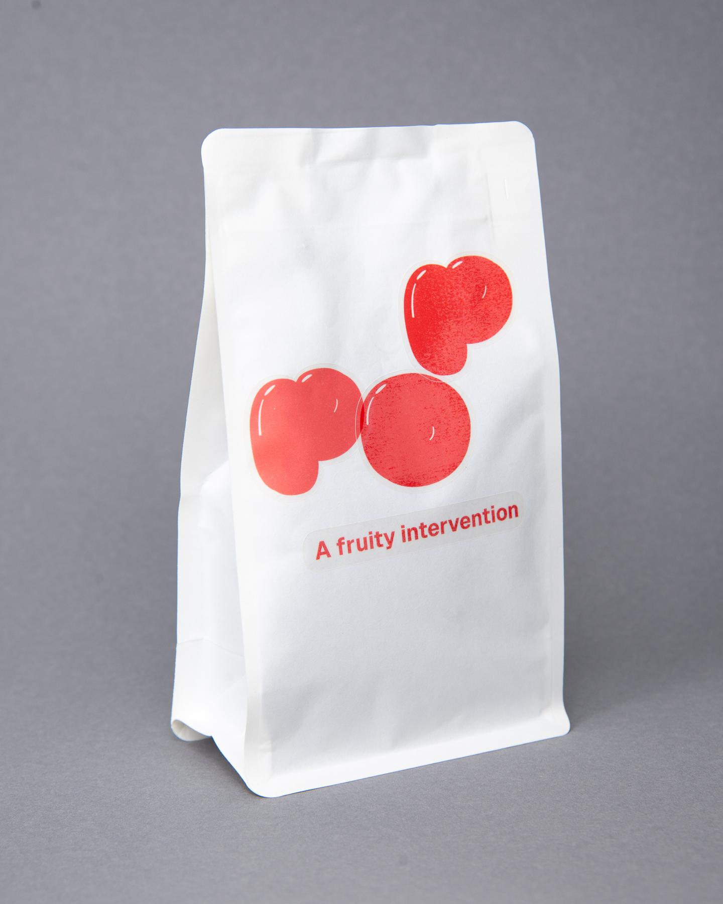
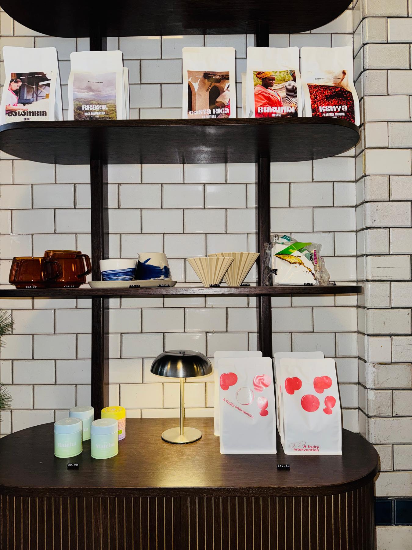
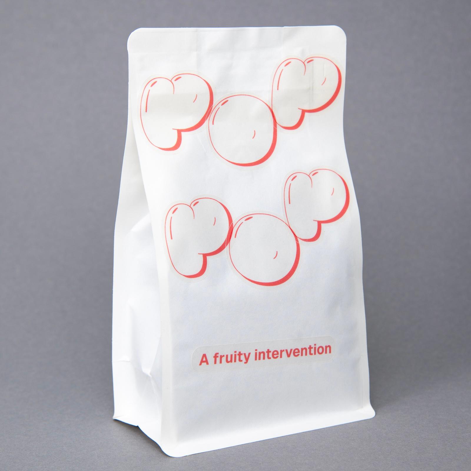
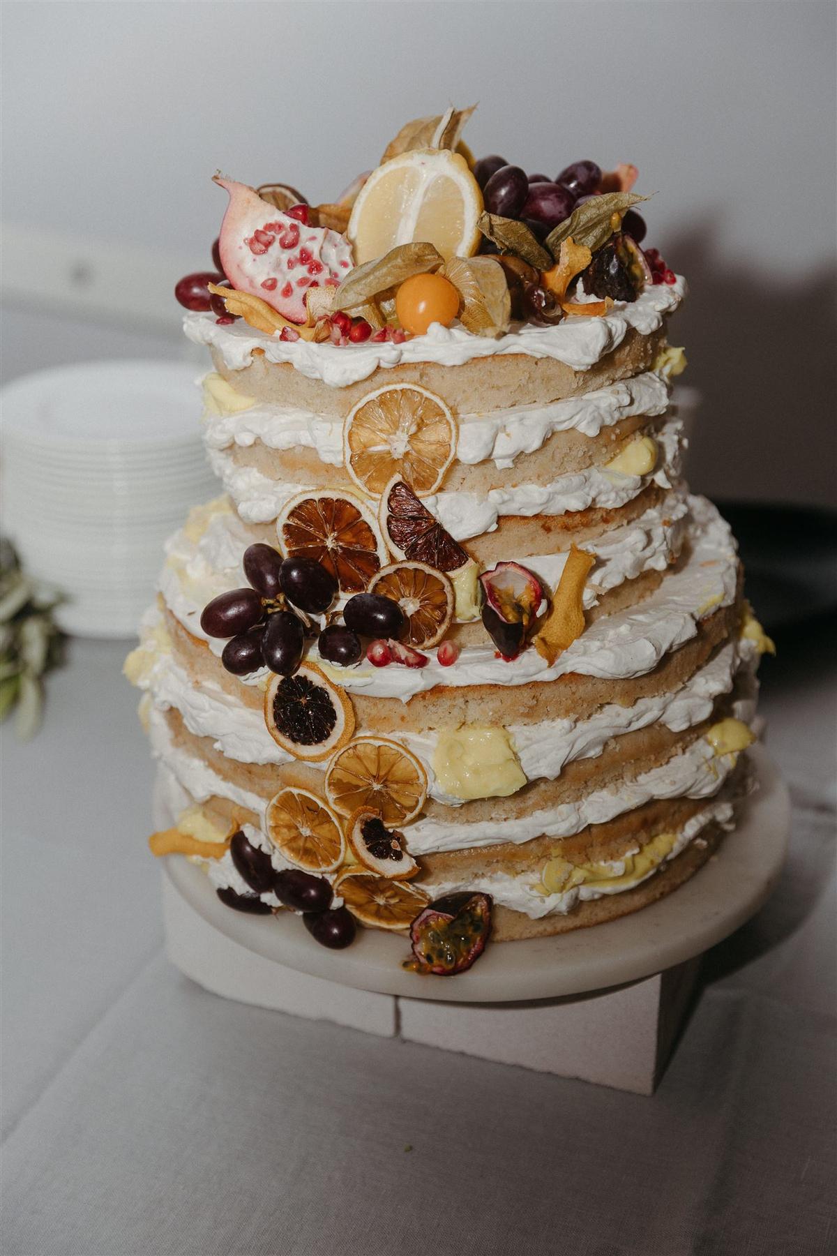
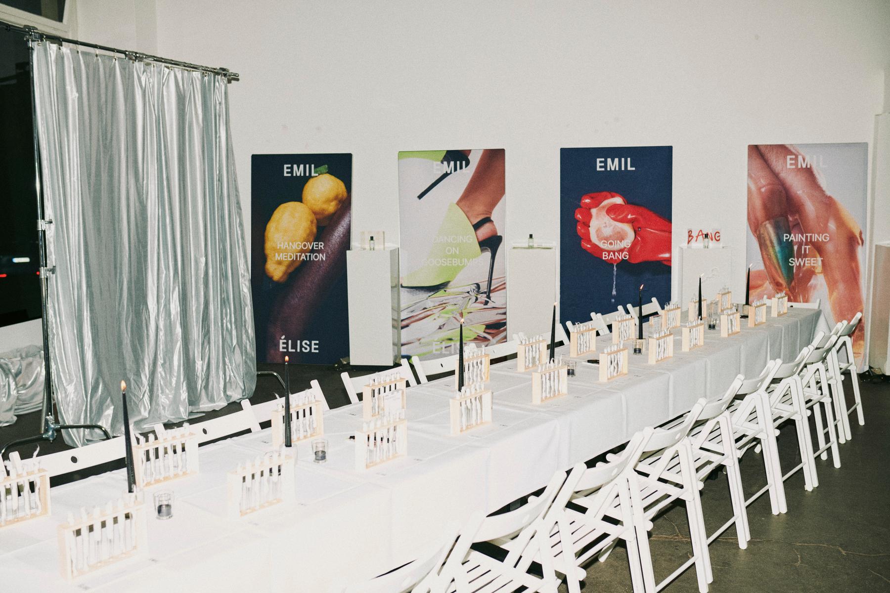
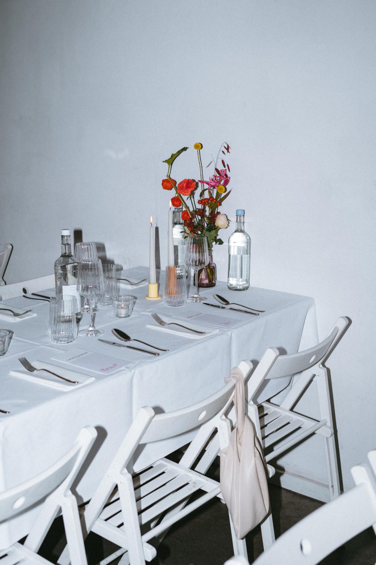
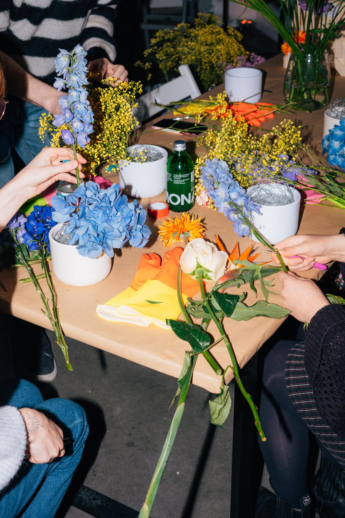
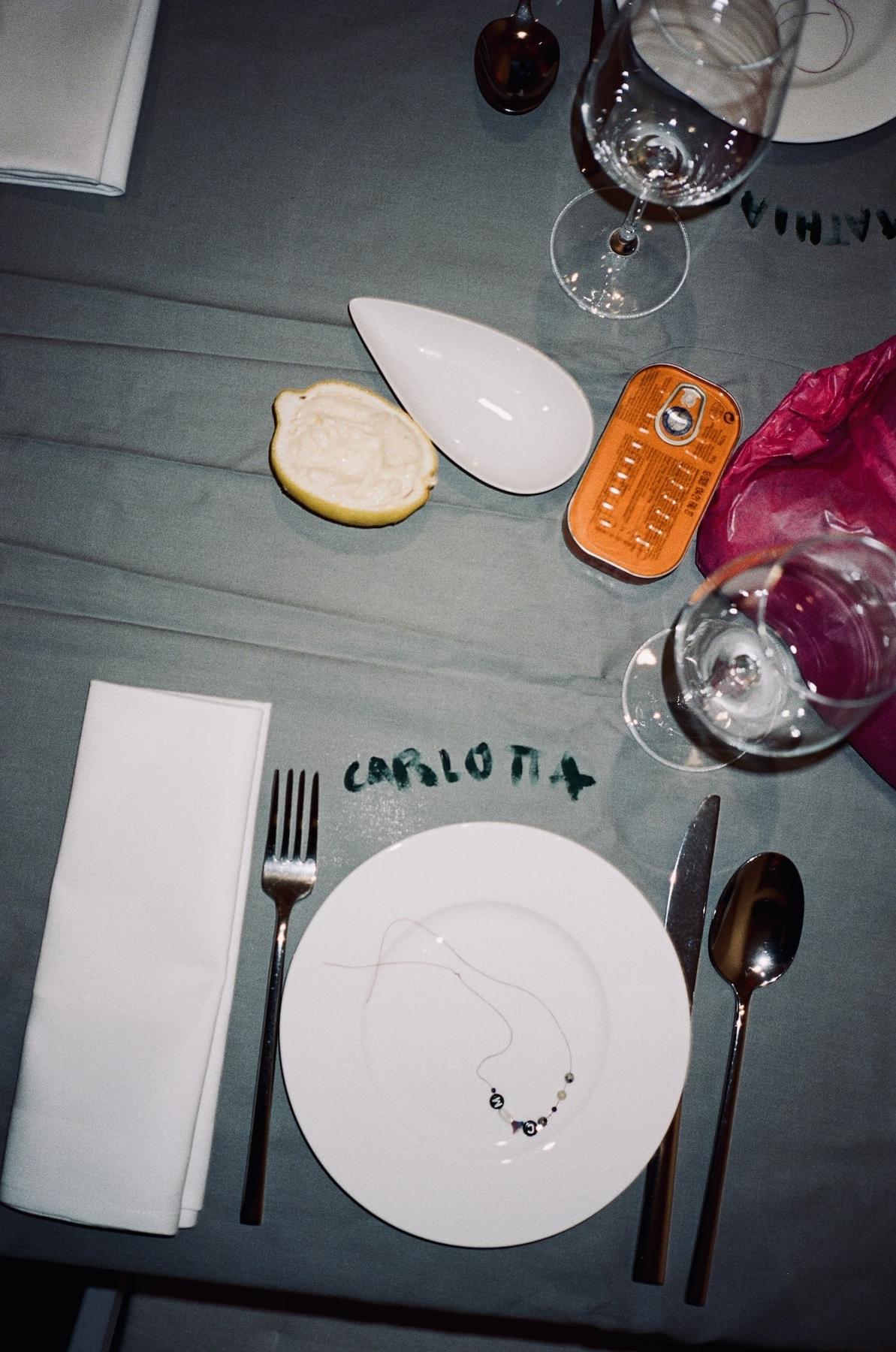
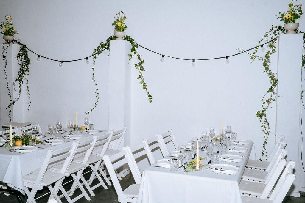
POP coffee
A fruity intervention, fall 2025
POP is a limited-edition coffee collaboration I created with Marshall Street Coffee Roasters — from the initial naming and product idea to the narrative, and activation formats. The visual logic was created by Malte Müller.
The core is a strawberry-fermented micro-lot that became a cultural object: a way to explore fermentation not as a trend, but as a signal of where specialty coffee is heading, where the value chain shifts towards the farmers.
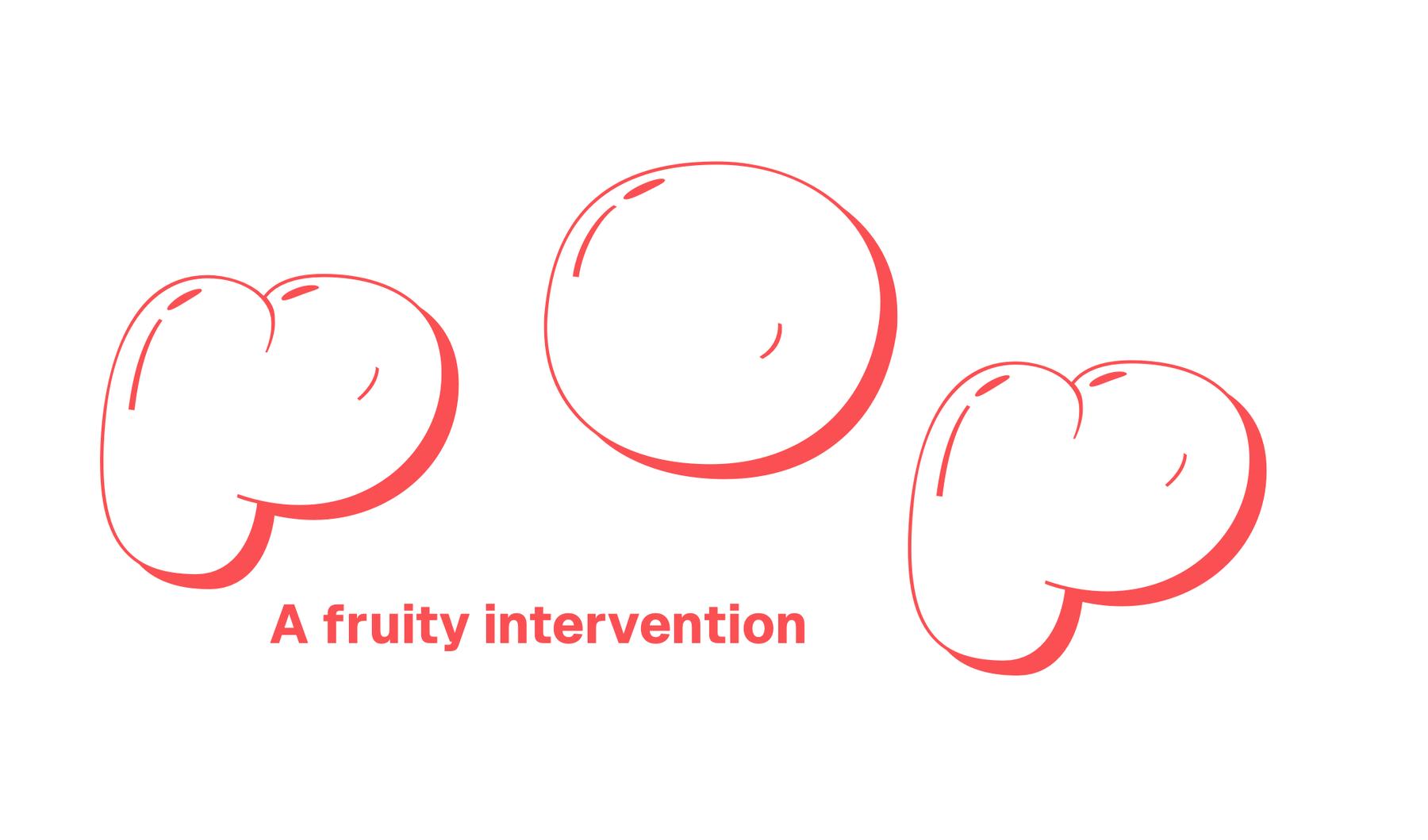
I built the world around the product across several touchpoints:
– a clear storyline and aesthetic frame
– packaging and communication that made the process tangible
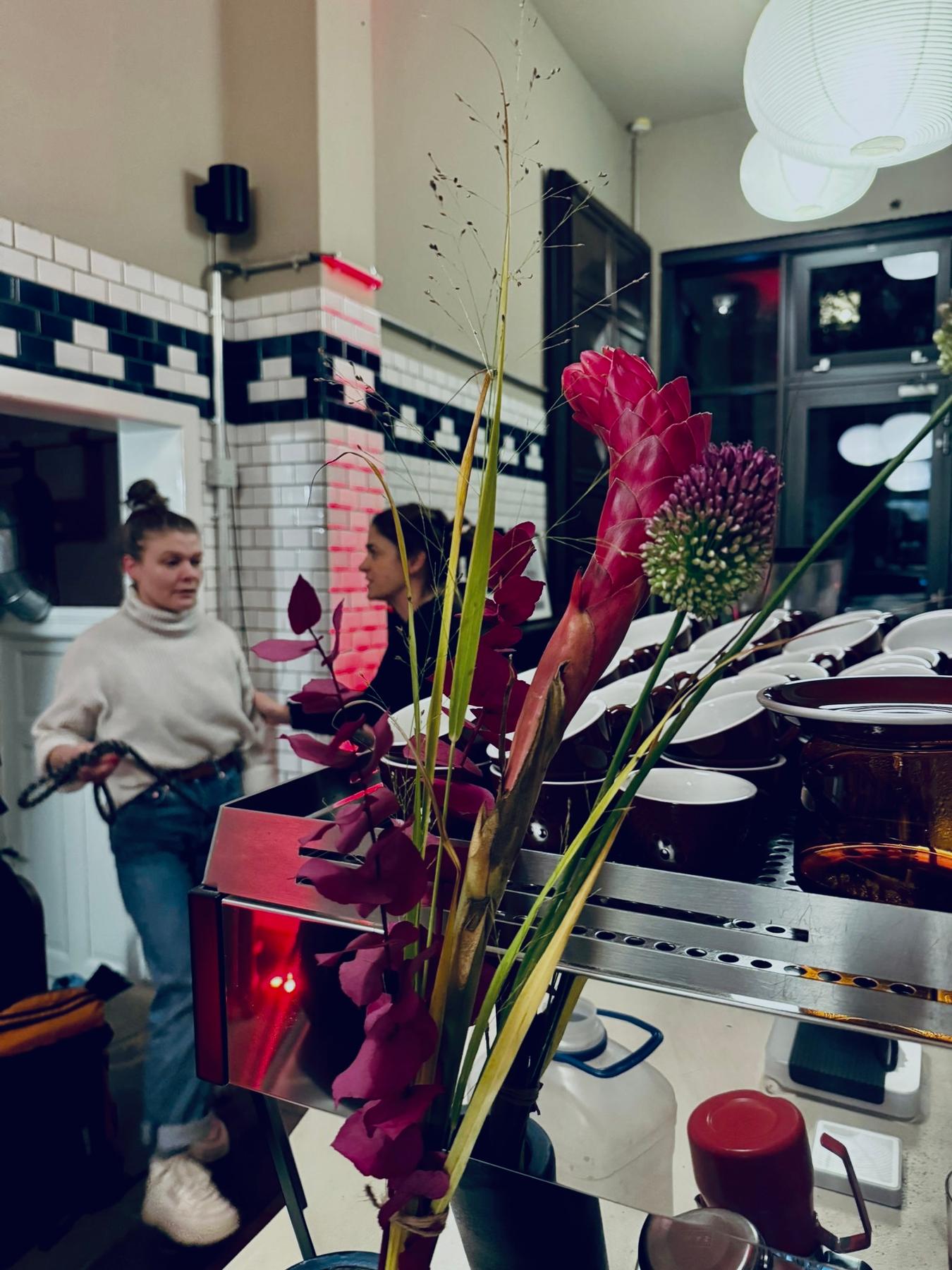
– a launch designed as a small social moment
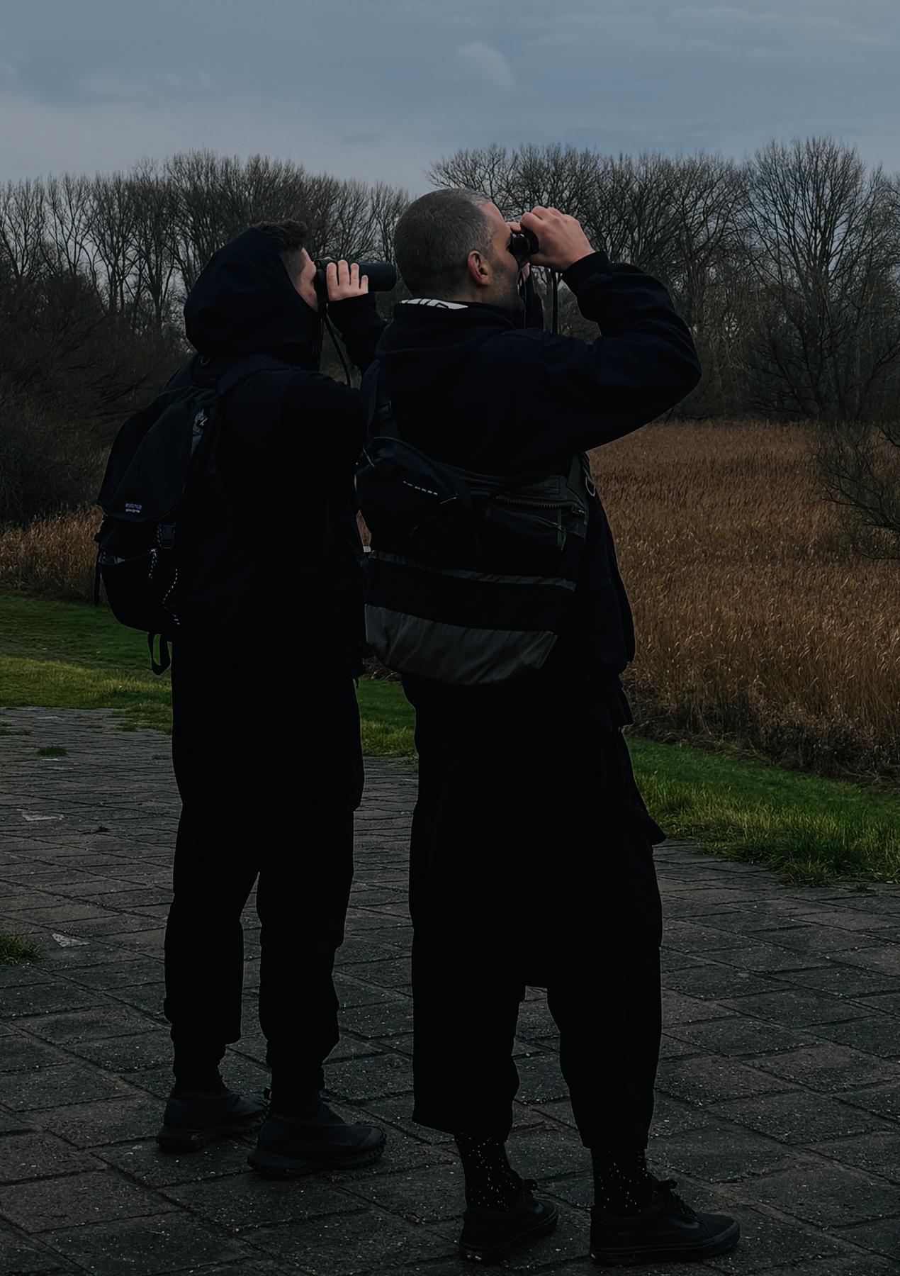
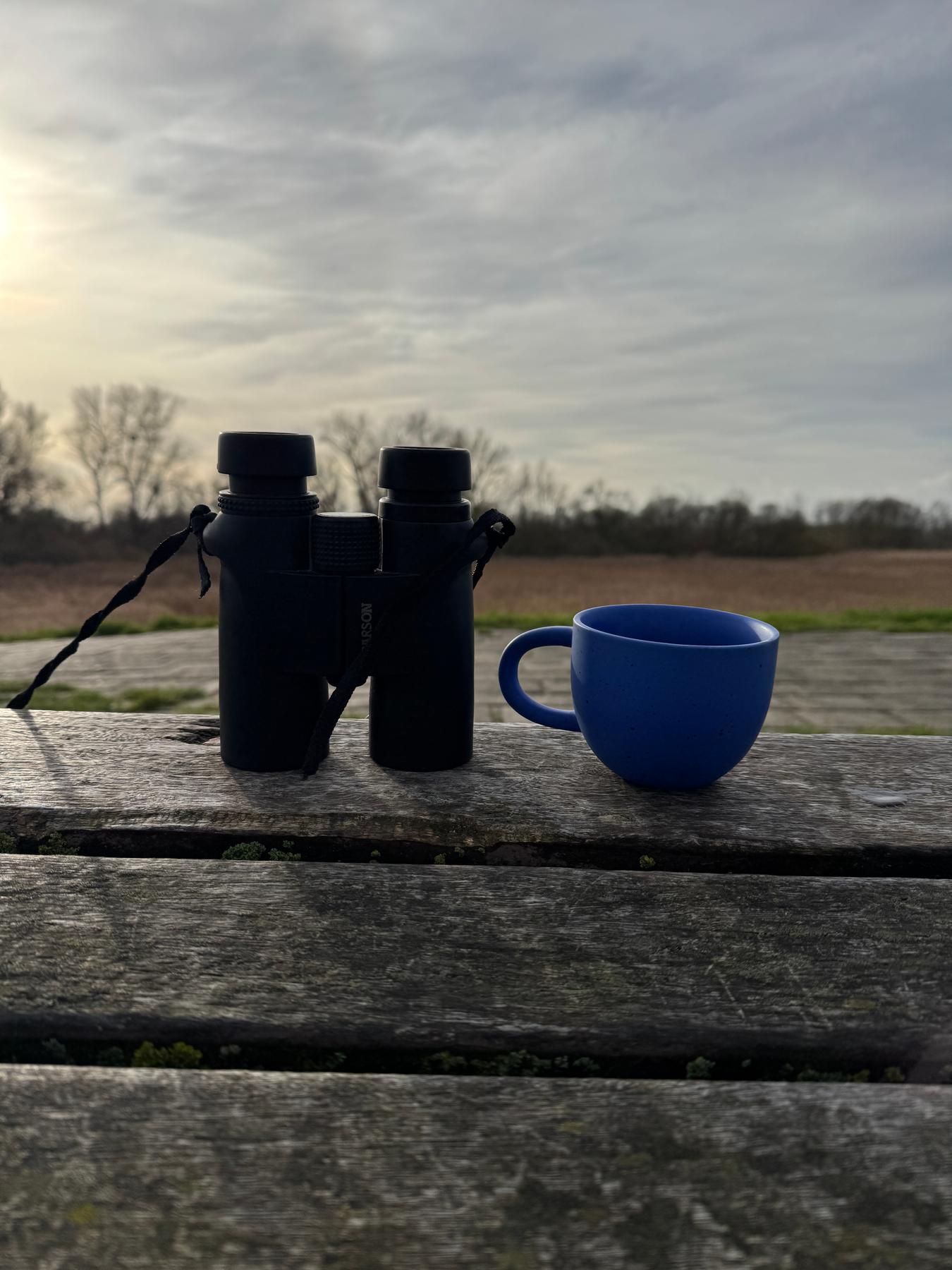
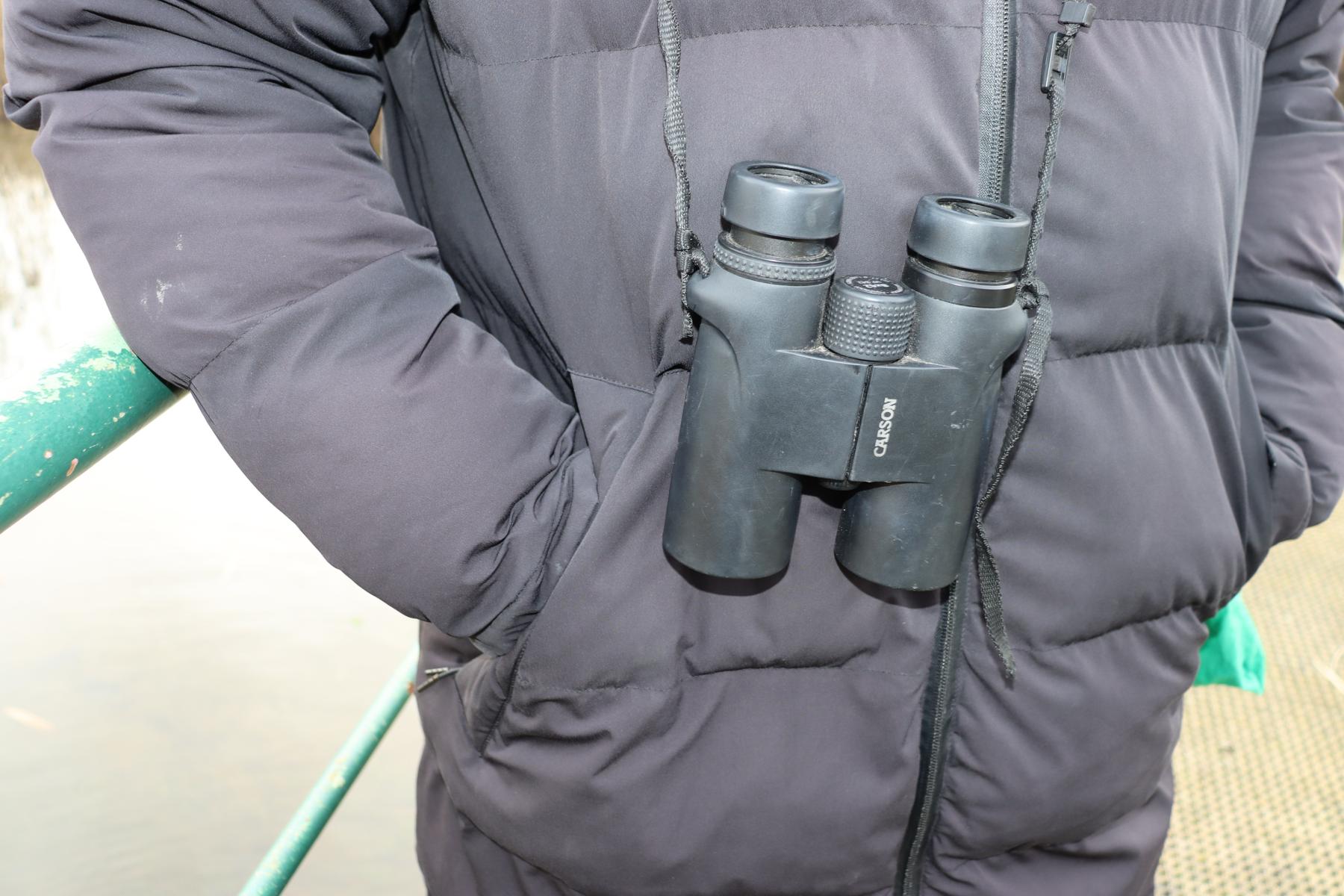
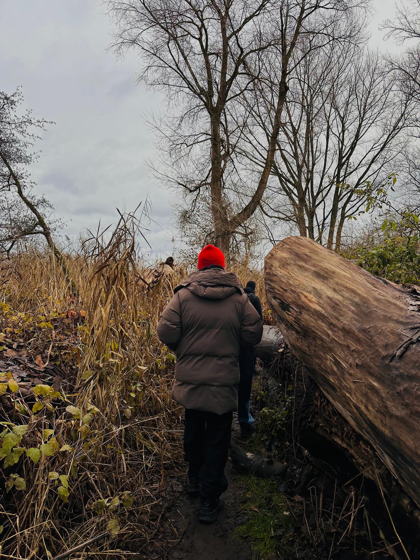
– a birding event that extended the world into nature, noticing and hospitality
POP captures my approach in miniature: start with one essential, design the atmosphere, then let the world unfold across context. A compact example of meaningful worldbuilding for brands.
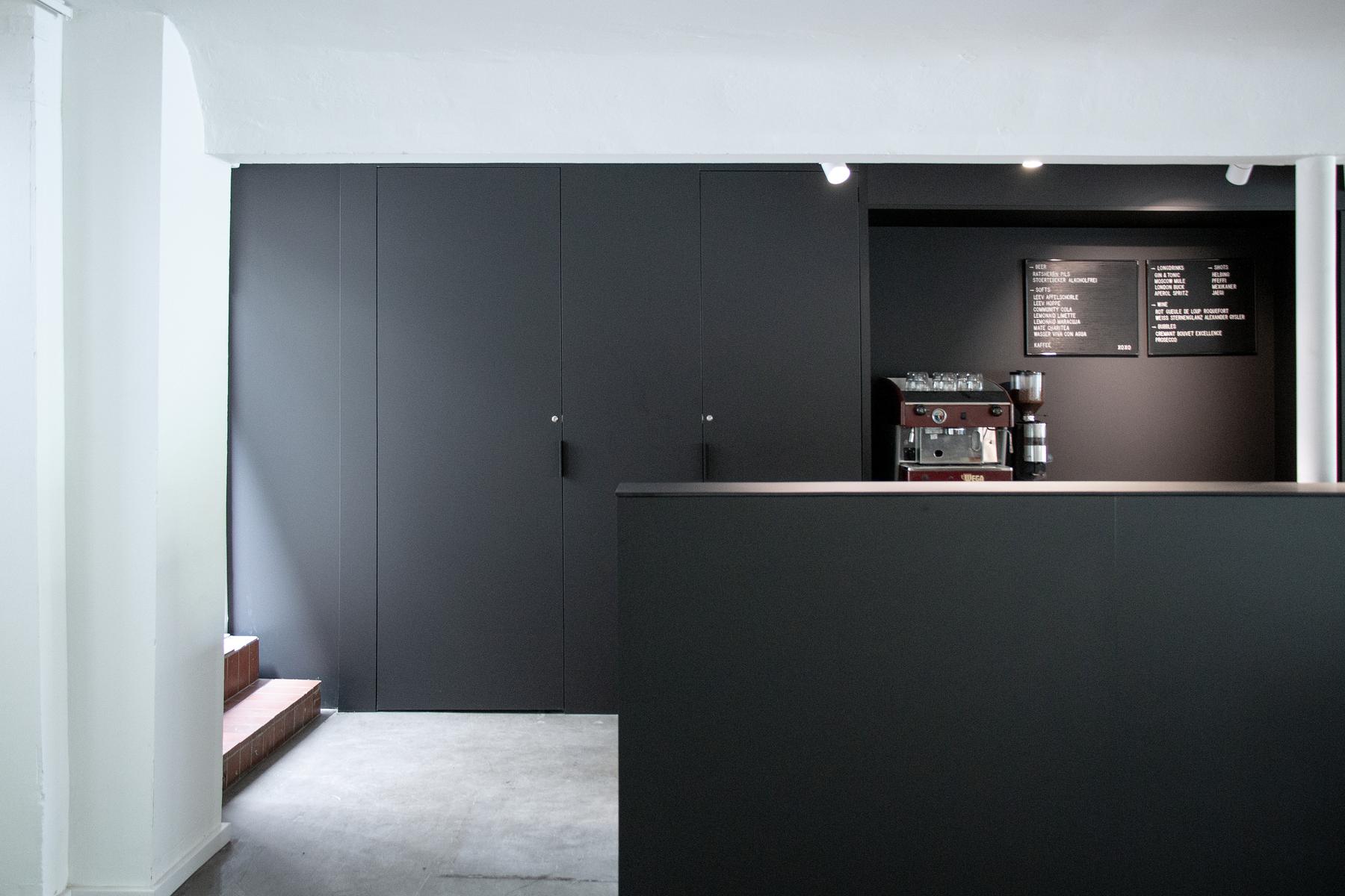
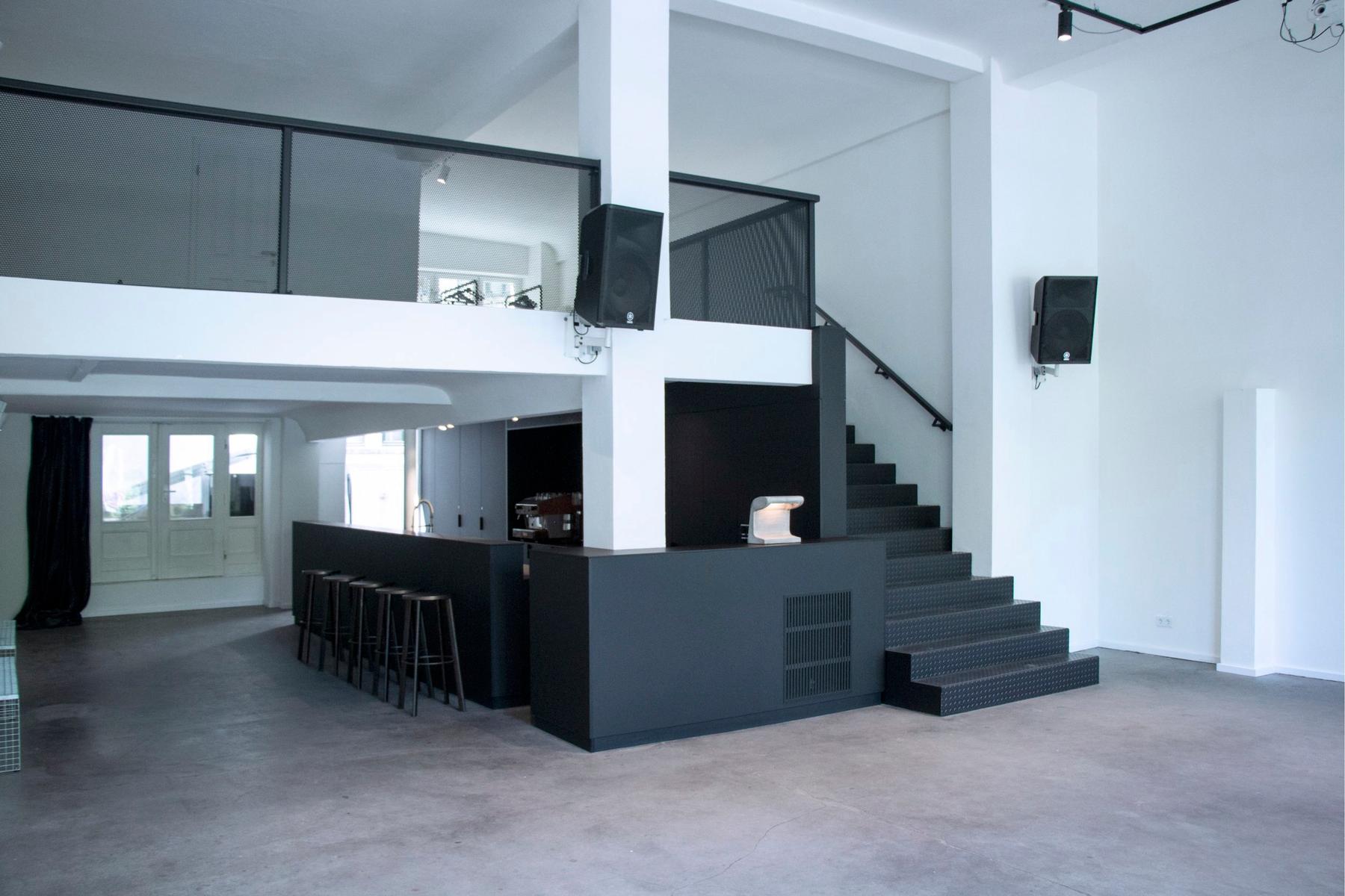
ISLAND
A flexible world for experiences, ongoing since 2012
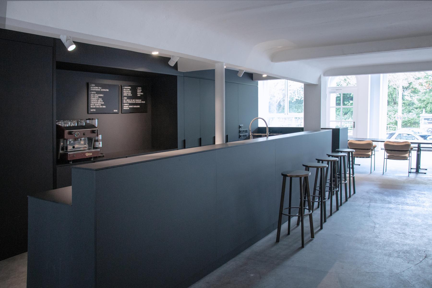
ISLAND started in 2012 as a pop-up gallery and has been intentionally shaped into a highly flexible off-space that, for over a decade now, offers a resonant room for events, exhibitions, and cultural formats. It’s an independent space that has stayed experimental — a place where professionalism meets cultural curiosity.
Over the years, ISLAND has naturally drawn a wide mix of people: private clients, brands, agencies, artists, and cultural practitioners. ISLAND works like an open system — a space that adapts to ideas, not the other way around. Technically agile, aesthetically minimal, and easy for people to step into and make their own.
The space was designed to do almost anything without forcing a storyline. The underlying ISLAND code is a quiet blend of clarity, openness, and unpolished precision — an atmosphere where ideas can unfold with ease and character.
Corporate Design: Lena Musmann und Christina Poelk
Web Experience: WAF GMBH
Interiour Design: Market Studios
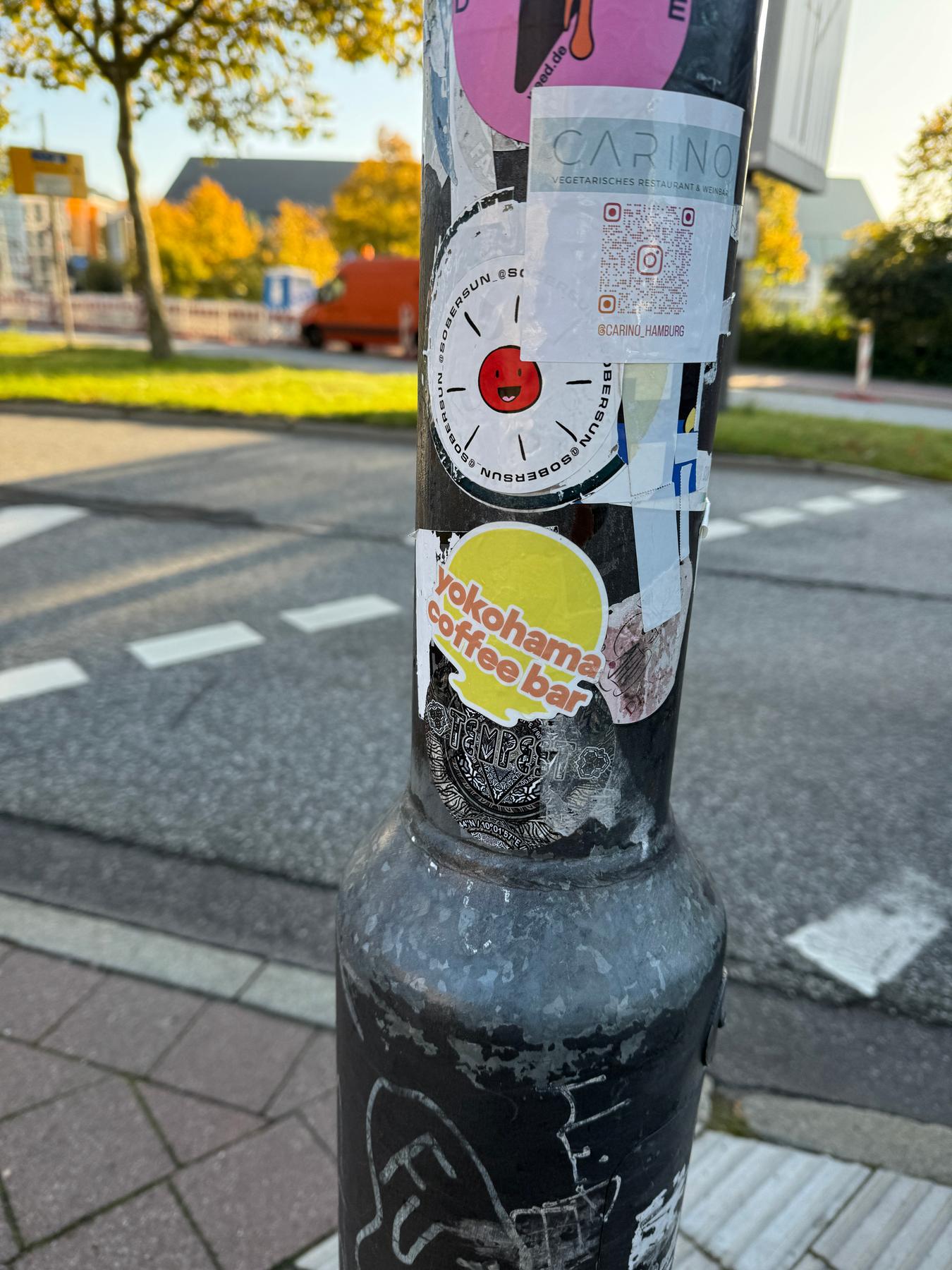
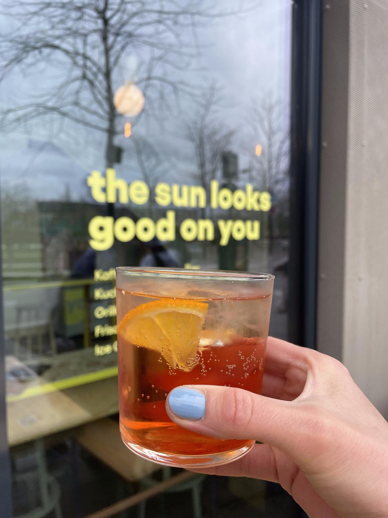
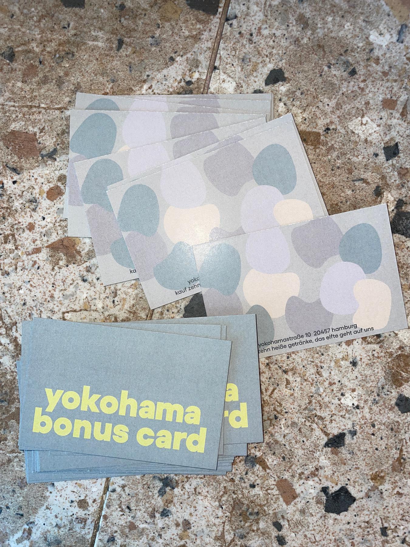
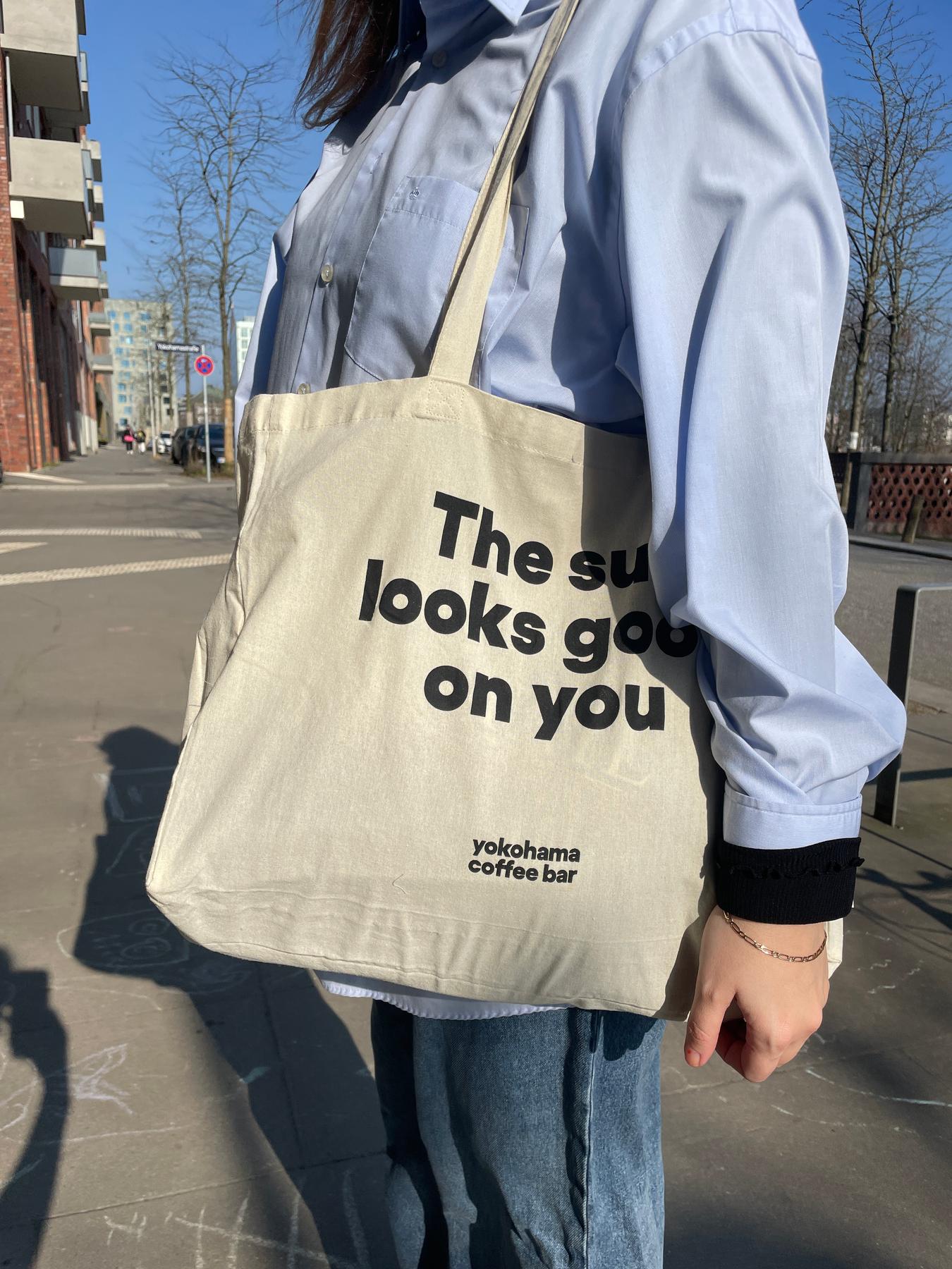
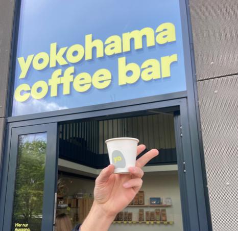
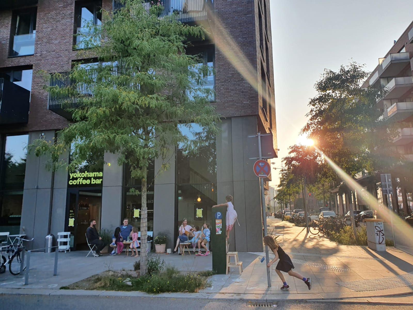
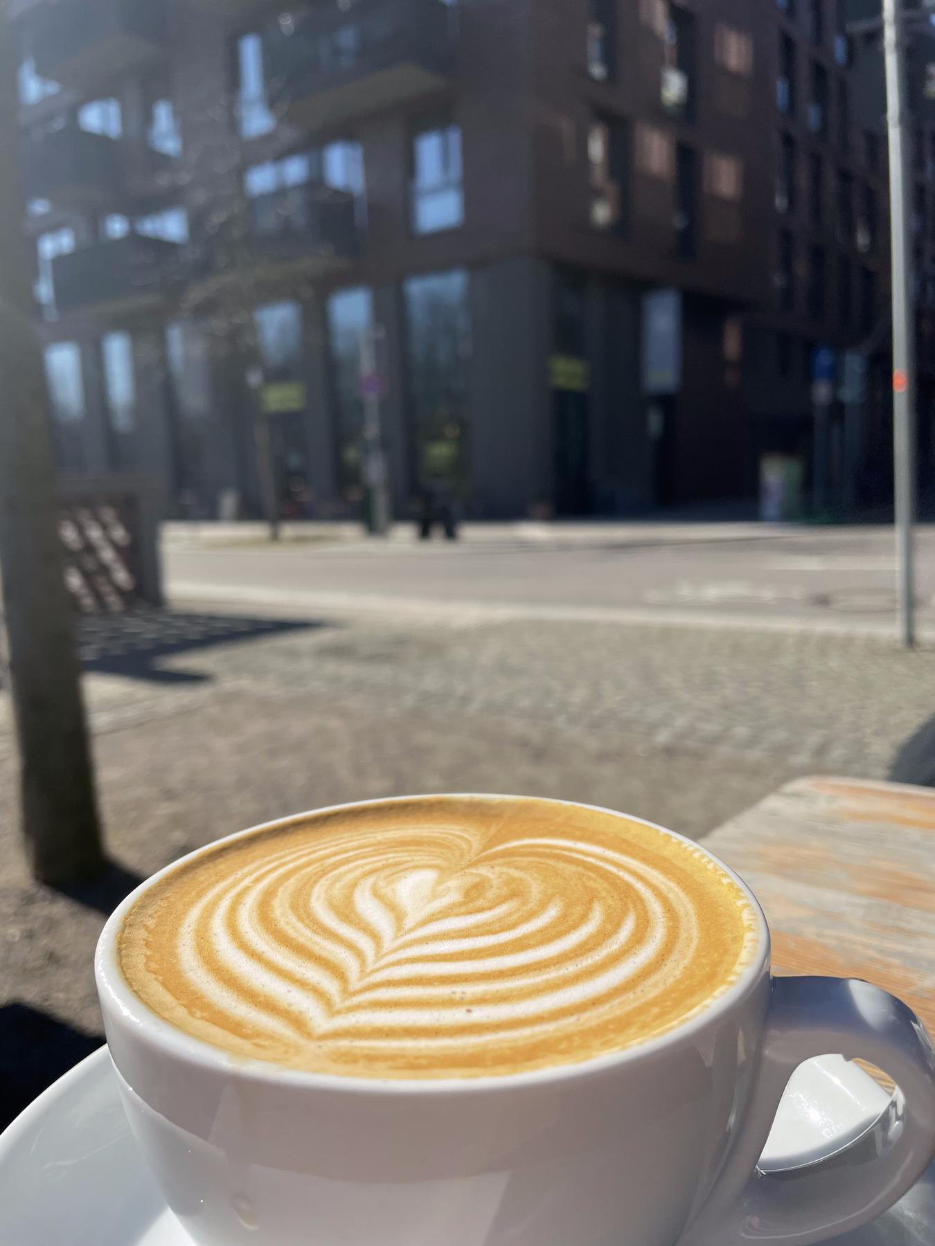
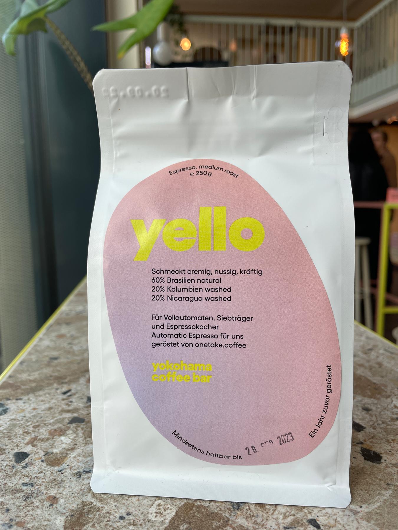
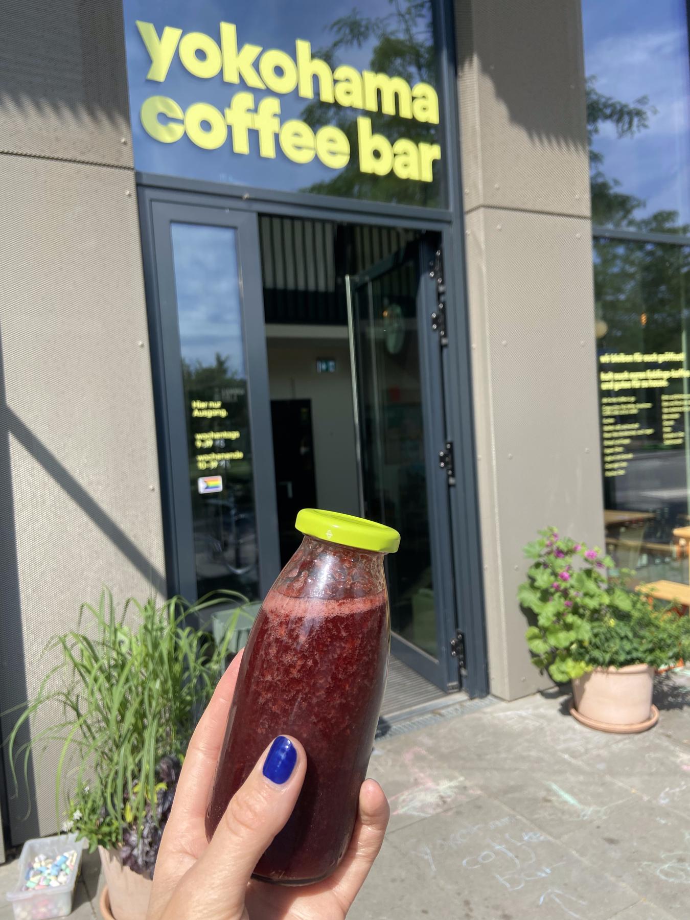
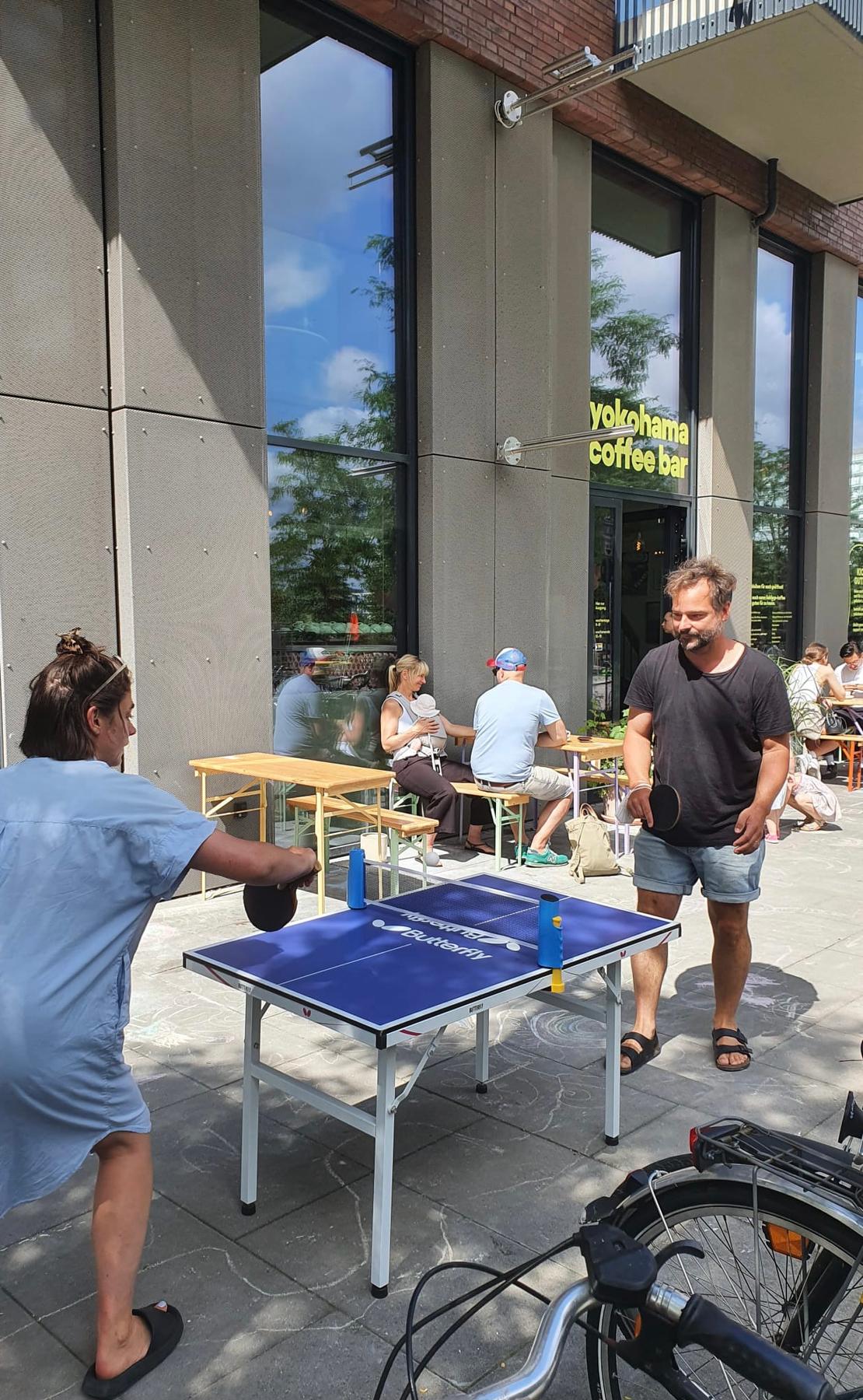
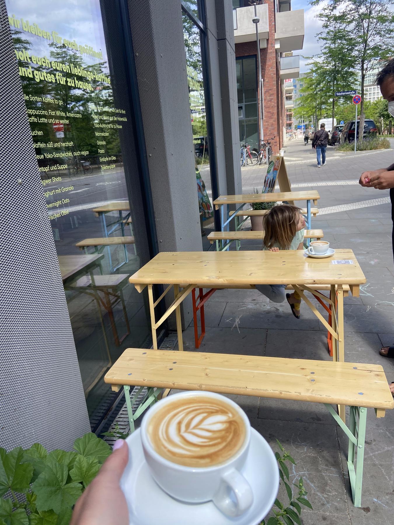
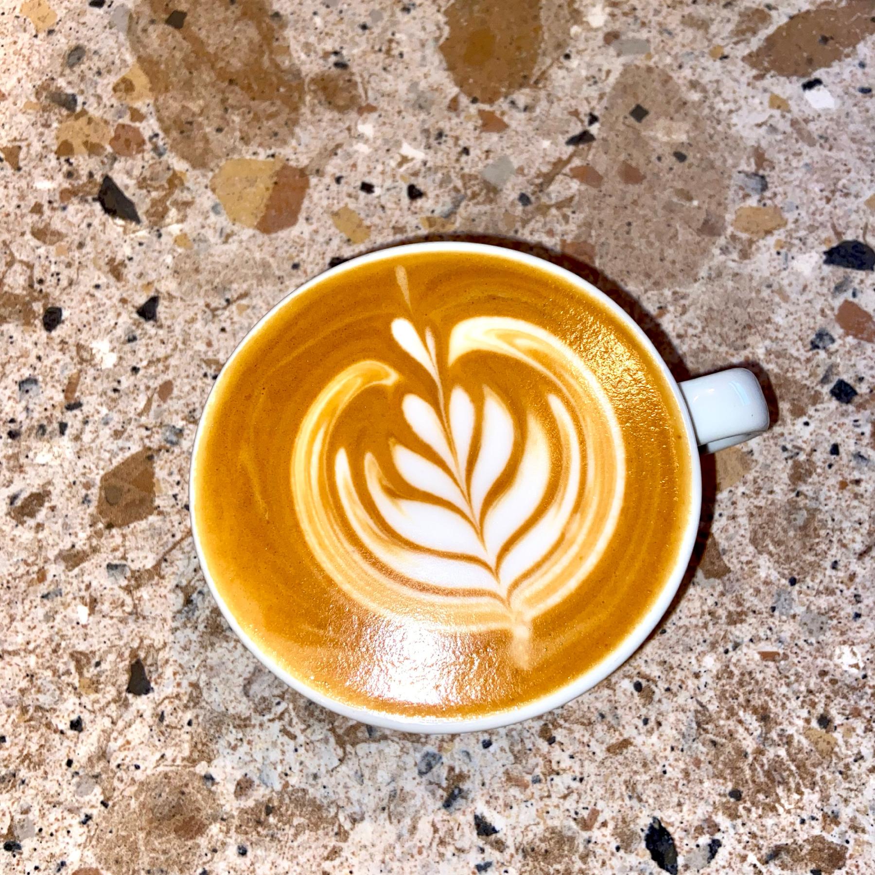
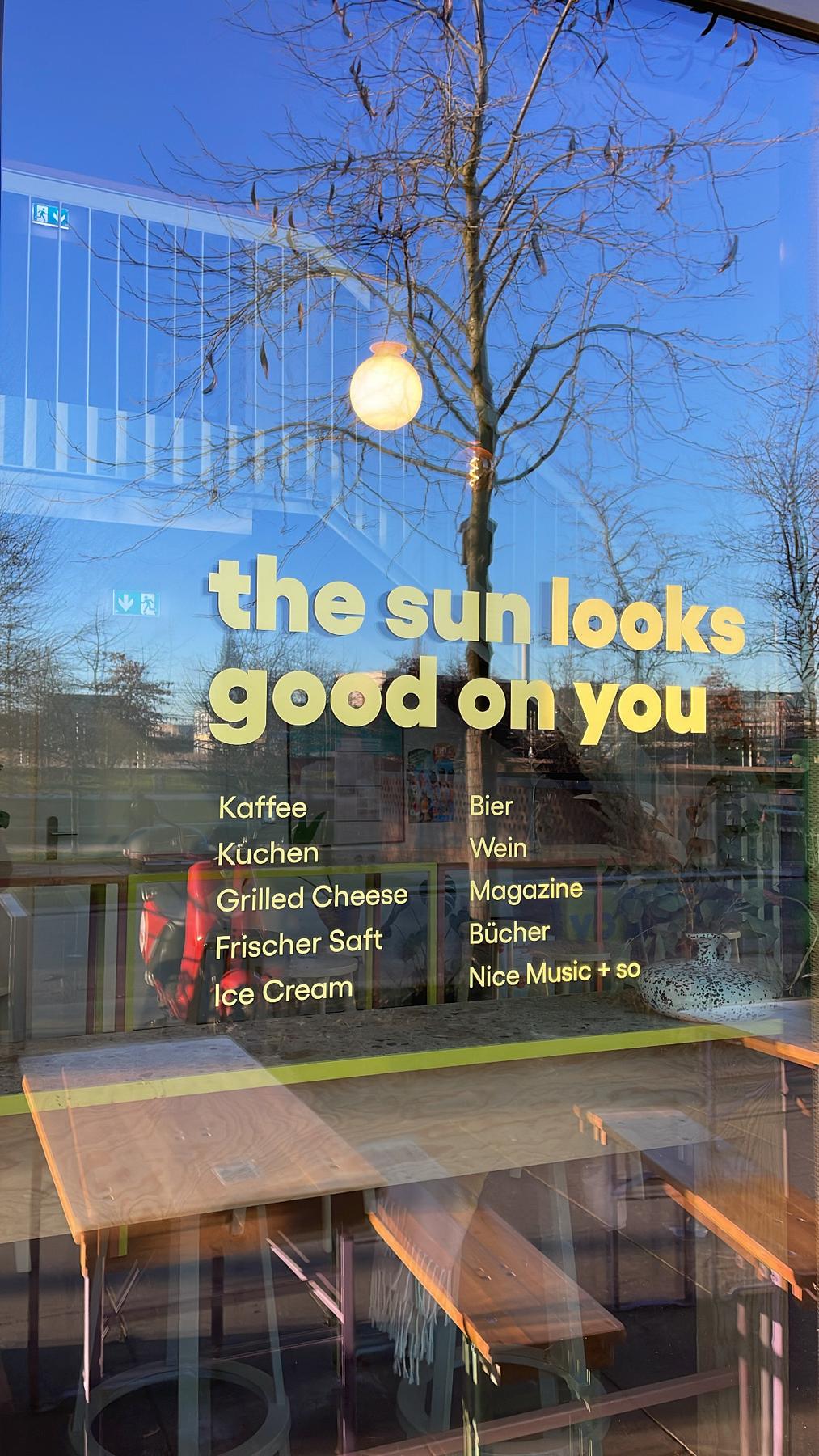
Yokohama Coffee Bar
A sun-forward neighbourhood world, 2020 - 2024
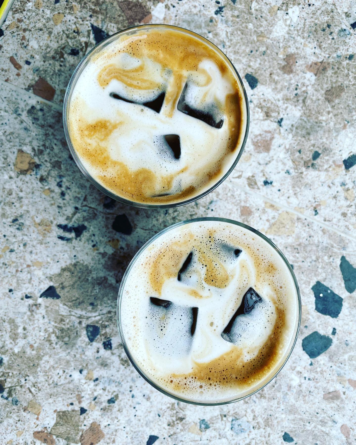
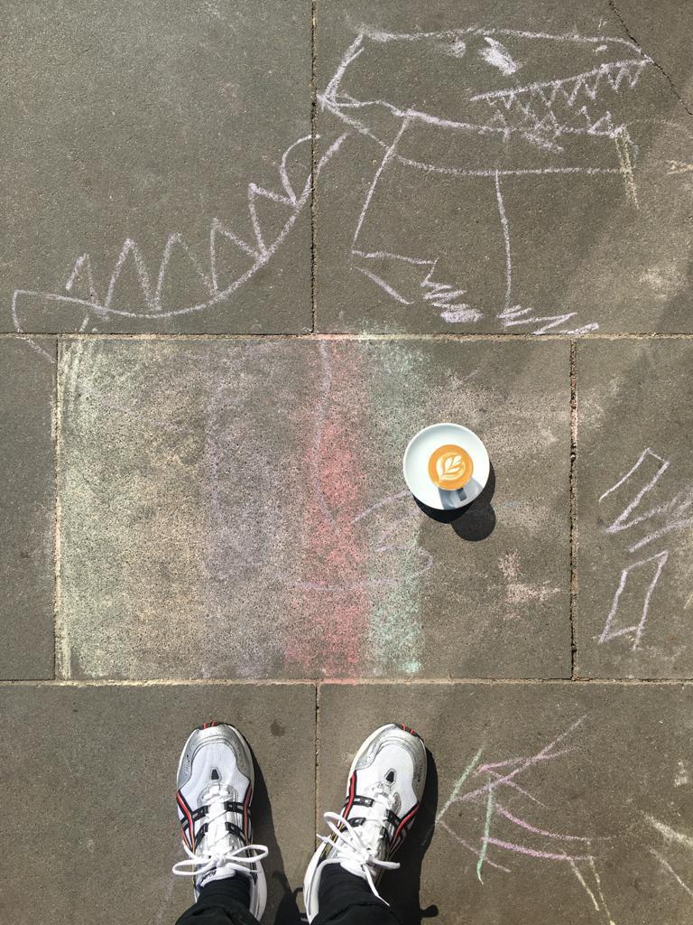
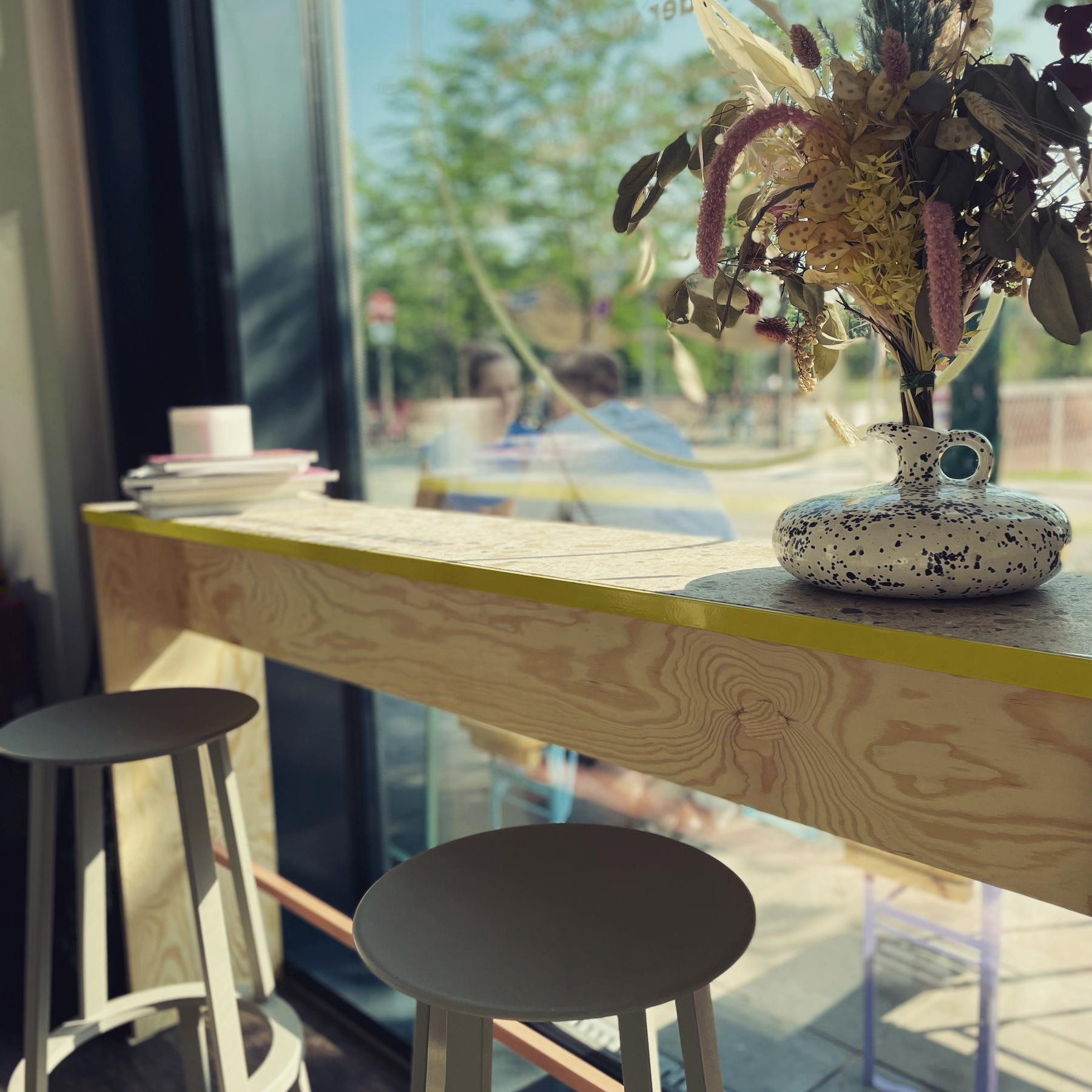
Yokohama Coffee Bar was designed as a small neighbourhood world — a place where specialty coffee could meet everyday life with lightness and joy. From the beginning, we wanted to build something bright and unintimidating — a mood that can be described as “sun-forward”: friendly, simple, confident, warm, optimistic, and playful. The credo: high quality / low ego — in the cup, in the room and in the brand. The core of the visual world was yellow, as a way of seeing.
The project had almost no budget, which became part of its logic. The spatial system stayed intentionally light: light colours and straightforward materials (maritime pine plywood, a light stone counter top), and few pieces of furniture we designed and built with Studio von Schmidt.
Because of its position by the park, the café naturally gathered a broad mix of people: families with kids, neighbours on their daily loop, remote workers, and coffee enthusiasts who crossed the city for a bright moment and a good brew.
We designed Yokohama to hold this mix — local energy meeting global coffee culture, supported by a lovely team of high skilled baristas with a great instinct for fun music. Yokohama became a coherent world shaped through yellow, clarity, and a quietly joyful way of being.
Corporate Design: WAF GMBH
Interiour Partner: von Schmidt, Christoph Schmidt